SYNC — Interactive Public Transpotation Experience
SYNC — New Interactive Experience Design
Designers: Junfan Zhu, Gina Wang, Aristotle Montanez, Miguel Parres
3D Animator: Brown Yoon
My Role: Concept Development/Sketching, Project Management, Research, UI/UX Design, Prototyping, Branding, Motion Graphic, Video Editing
Instructor: Jeff Nigashi, Elise Co, Marek Djordjevic
Duration:May – August 2017
Category: UI/UX | Graphic Design | Product Design | Transportation Design | Branding | Brand Strategy
Design Team: GJAM | Junfan Zhu, Gina Wang, Aristotle Montanez, Miguel Parres
3D Animator: Brown Yoon
Role: Concept Development/Sketching, Project Management, Research, UI/UX Design, Branding, Motion Graphic, Video Editing
Instructor: Jeff Nigashi, Elise Co, Marek Djordjevic
Duration:May – August 2017
Overview:
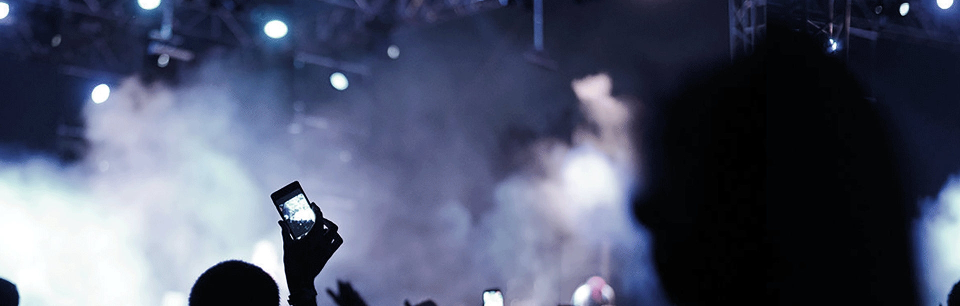
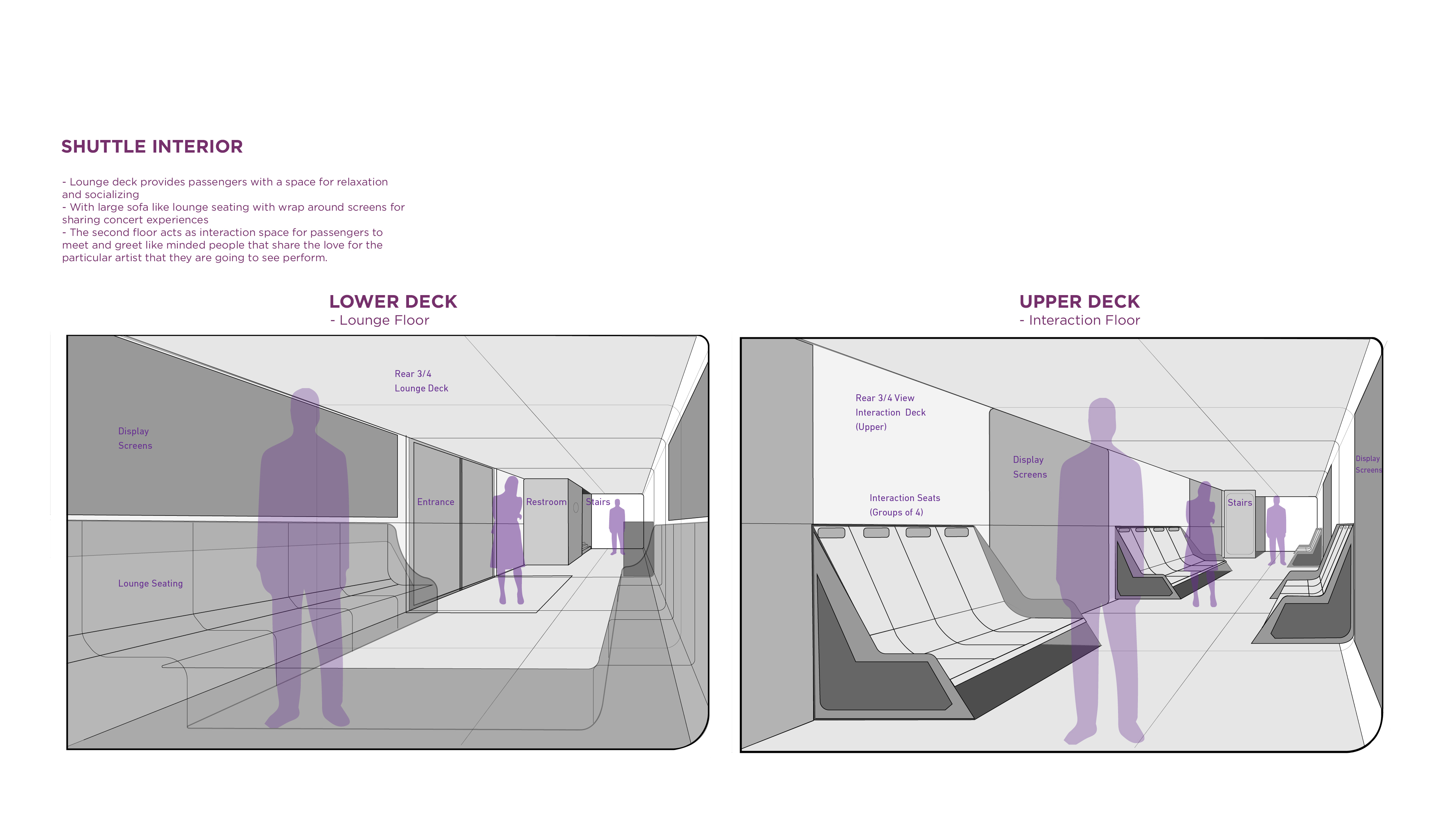
SYNC is a reimagined shuttle experience project sponsored by Samsung which encourages socializing and interaction amongst passengers by expanding the concert journey from pick-up to drop-off for the fabulous Forum in Los Angeles.
SYNC offers a mobile application which enhances the ecosystem we create for communication, changes people meeting and making friends, and shares their experiences.
Over the course of 14 weeks, my team conceptualized, pitch, design and produce an ecosystem of both physical prototype and accompanying digital interfaces/interactions. I was in charge of identity design, UI/UX and final scenario video making.
Description:
A course exploring the future of entertainment transportation experience. The project was done in teams consisting of individuals from various disciplines. Over the course of 14 weeks, we were to conceptualize, pitch, design and produce an ecosystem of both the physical prototypes and accompanying digital interfaces/interactions. This course was done with the guidance of multiple professors from ArtCenter College of Design.
The course focused on reimaging new ways of entertainings on the go while people in small space such as transportation, warming up before your events, make friends, expending whole experiences, and hope the end never came.
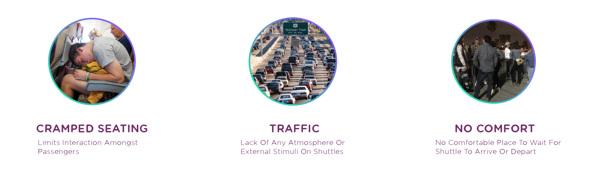
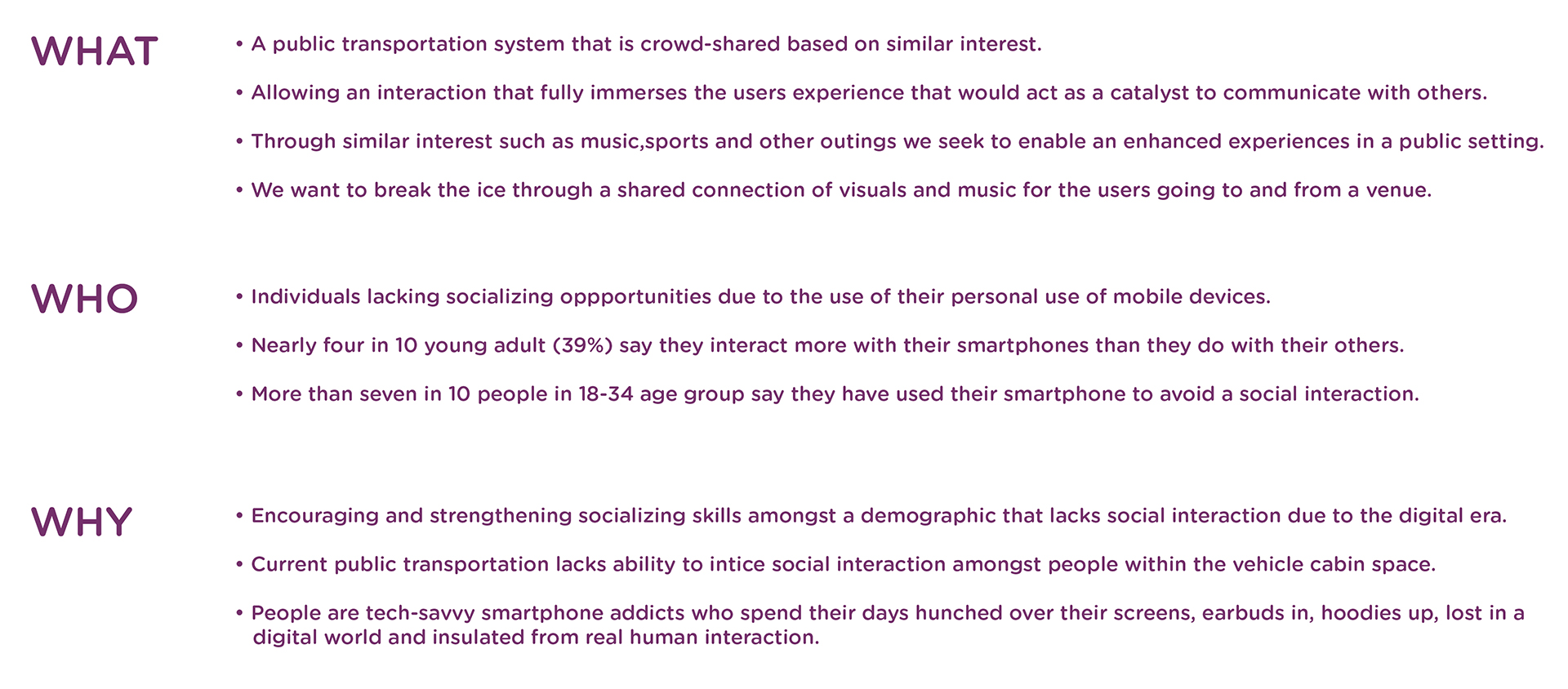
User Painpoints
Our Experiences
Our Experiences
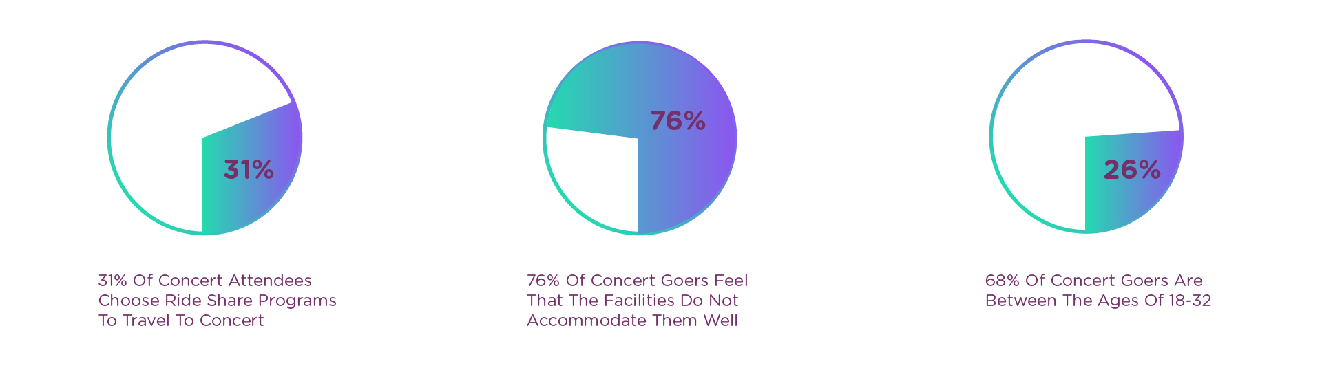
Research Data
Research Data
Research Data
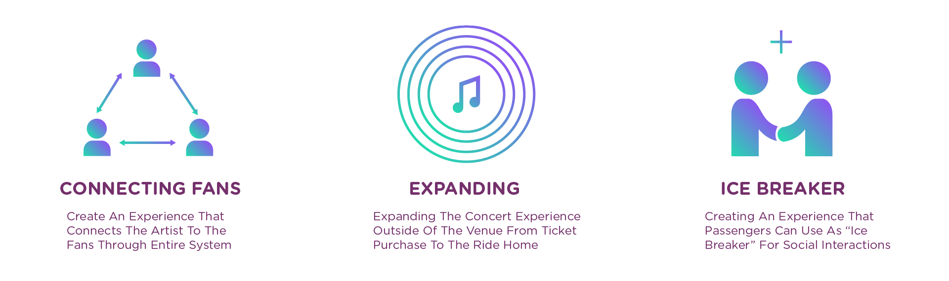
Opportunities
Opportunities
Opportunities
The Mission
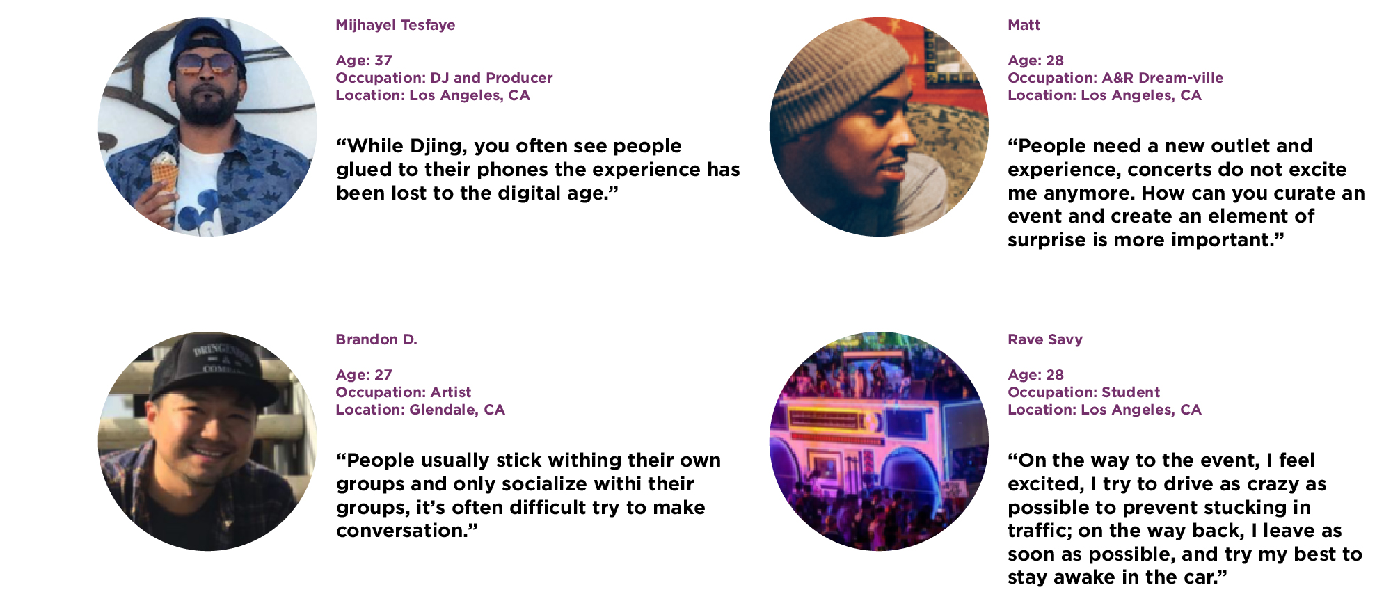
User Interviews
Interview
Interview
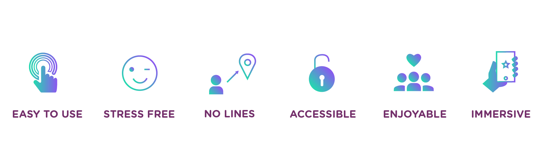
Project Attributes
Project Attributes
Project Attributes
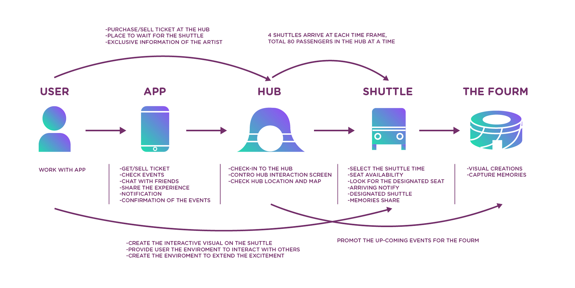
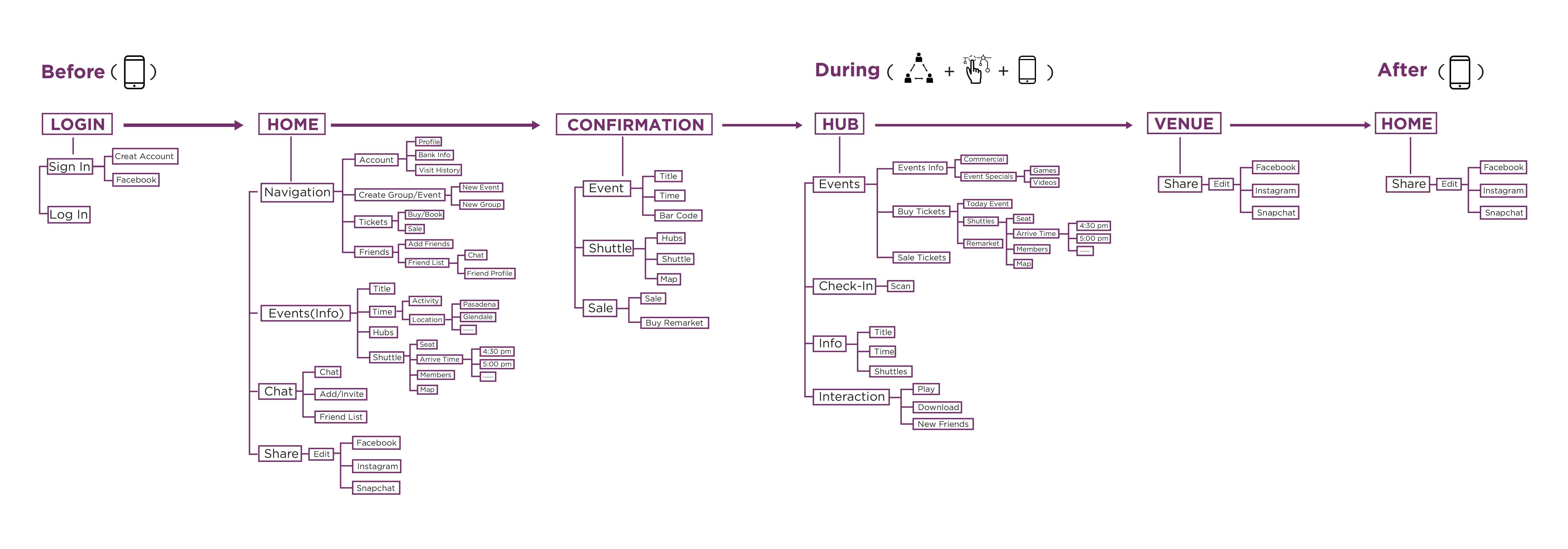
System Diagram
System Diagram
System Diagram
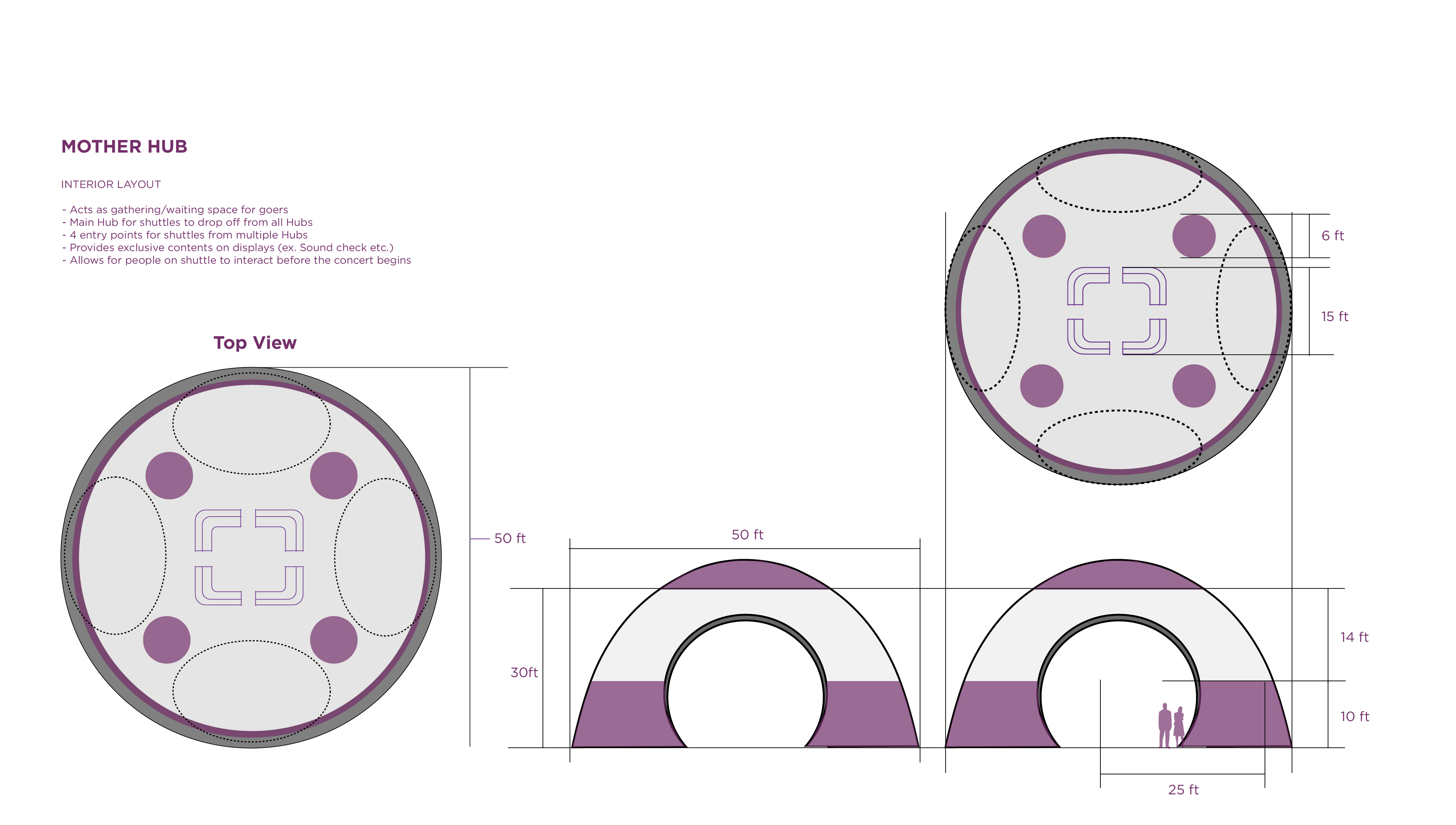
We decided to design the system which focused on the locations, Mobile—Hub—Shuttle—Fourm, to make the system more clear and easily understand, and also giving the audience more options while they use SYNC differently and spontaneously.
We decided to design the system which focused on the locations, Mobile—Hub—Shuttle—Fourm, to make the system more clear and easily understand, and also giving the audience more options while they use SYNC differently and spontaneously.
Brand Identity
The Logo
Brand Identity
Design Concept
Design Concept
The SYNC is a new identity which designed for the new interactive transportation system. The concept behind the design is based on our primary research and interviews and aiming to solve people's pain points when they go out. The logo is combined with logo mark S Loop and friendly rounded logotype.
The logo mark is made by 3 connected loops which create a letter S. The mark is showing ideas of connecting, connects people, locations, time and emotions. The outline shapes links together fold from center opens up, which never ends, the idea is aiming to show our new interactive transportation system is well considered, enhanced, encouraged and immersive.
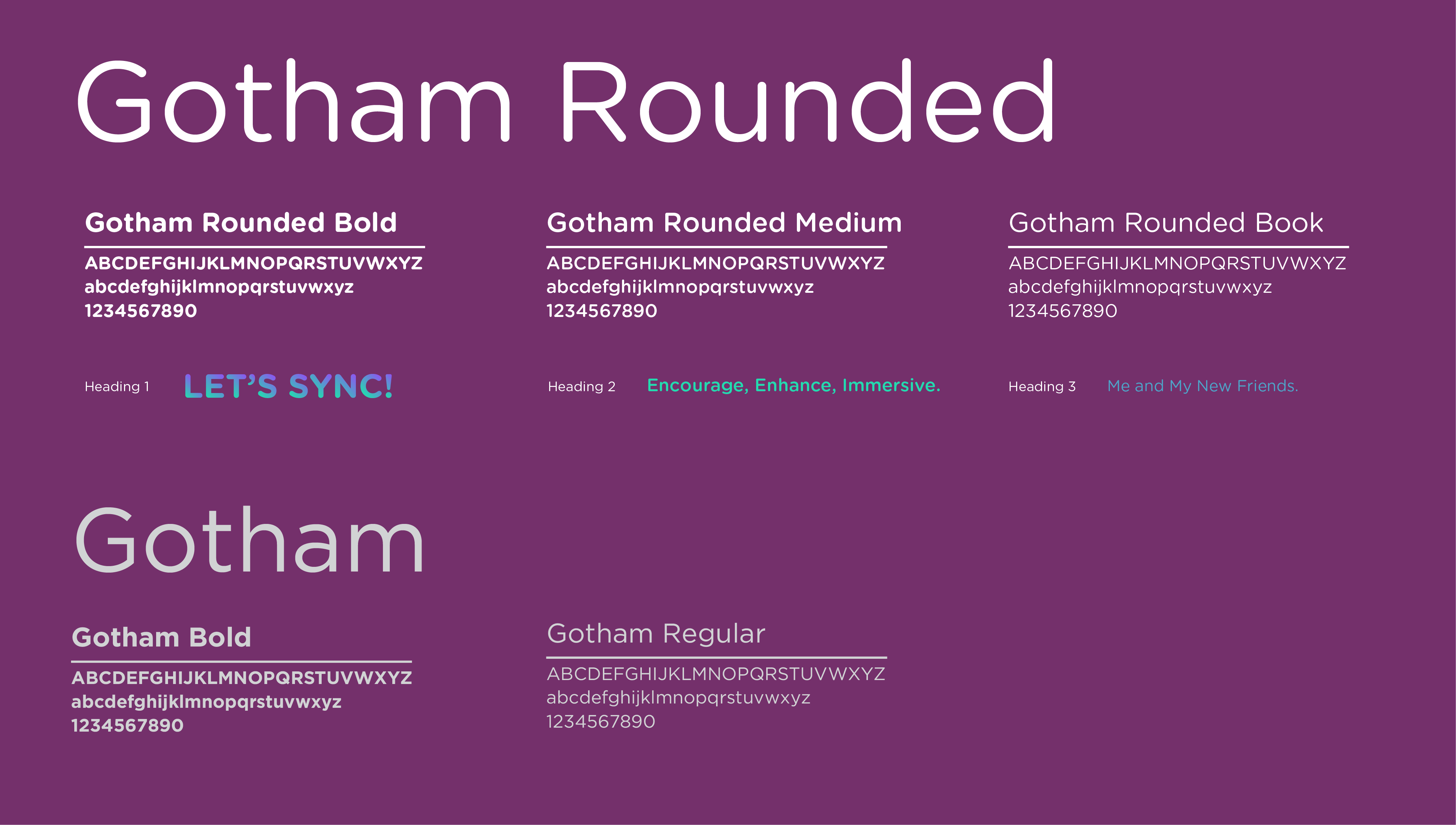
The new logotype is also giving our target audience modern, friendly feelings by using Gotham Rounded typeface, and the slogan we chose to use similar Gotham typeface to make the logo more integrated.
The SYNC is a new identity which designed for the new interactive transportation system. The concept behind the design is based on our primary research and interviews and aiming to solve people's pain points when they go out. The logo is combined with logo mark S Loop and friendly rounded logotype.
The logo mark is made by 3 connected loops which create a letter S. The mark is showing ideas of connecting, connects people, locations, time and emotions. The outline shapes links together fold from center opens up, which never ends, the idea is aiming to show our new interactive transportation system is well considered, enhanced, encouraged and immersive.
The new logotype is also giving our target audience modern, friendly feelings by using Gotham Rounded typeface, and the slogan we chose to use similar Gotham typeface to make the logo more integrated.
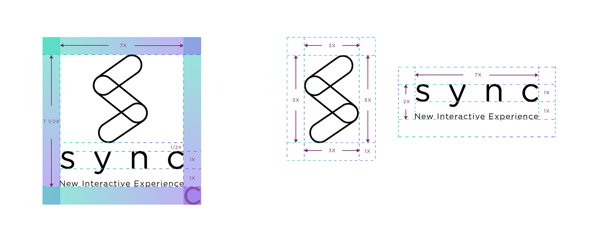
Logo Lock-up | Clear Zone
Logo Lock-up | Clear Zone
Logo Lock-up | Clear Zone
Typography
Typography
Typography
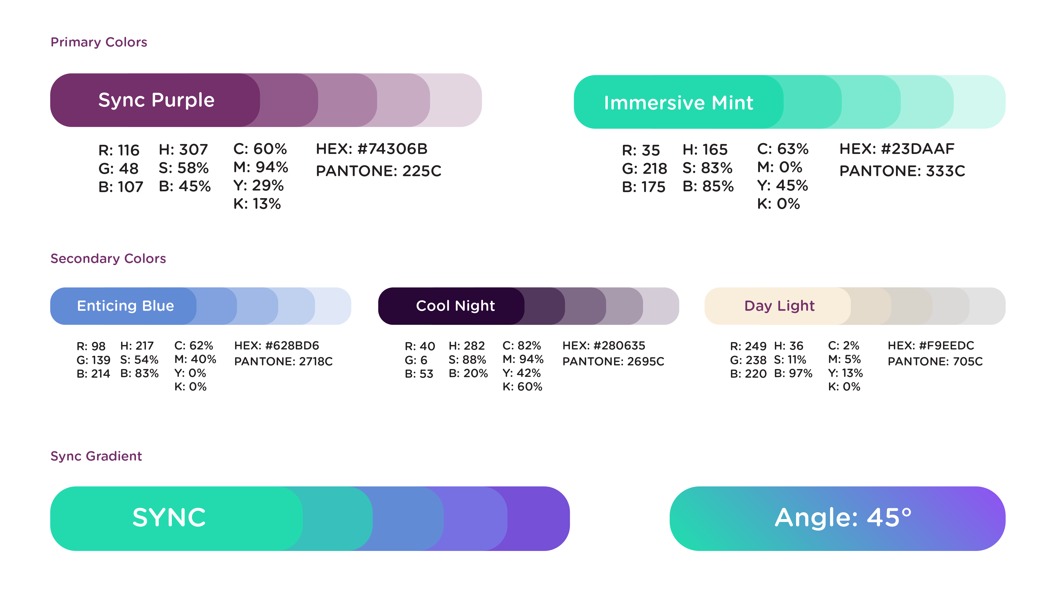
Color Palette
Color Palette
Color Palette
Experience Flowchart
Experience Flowchart
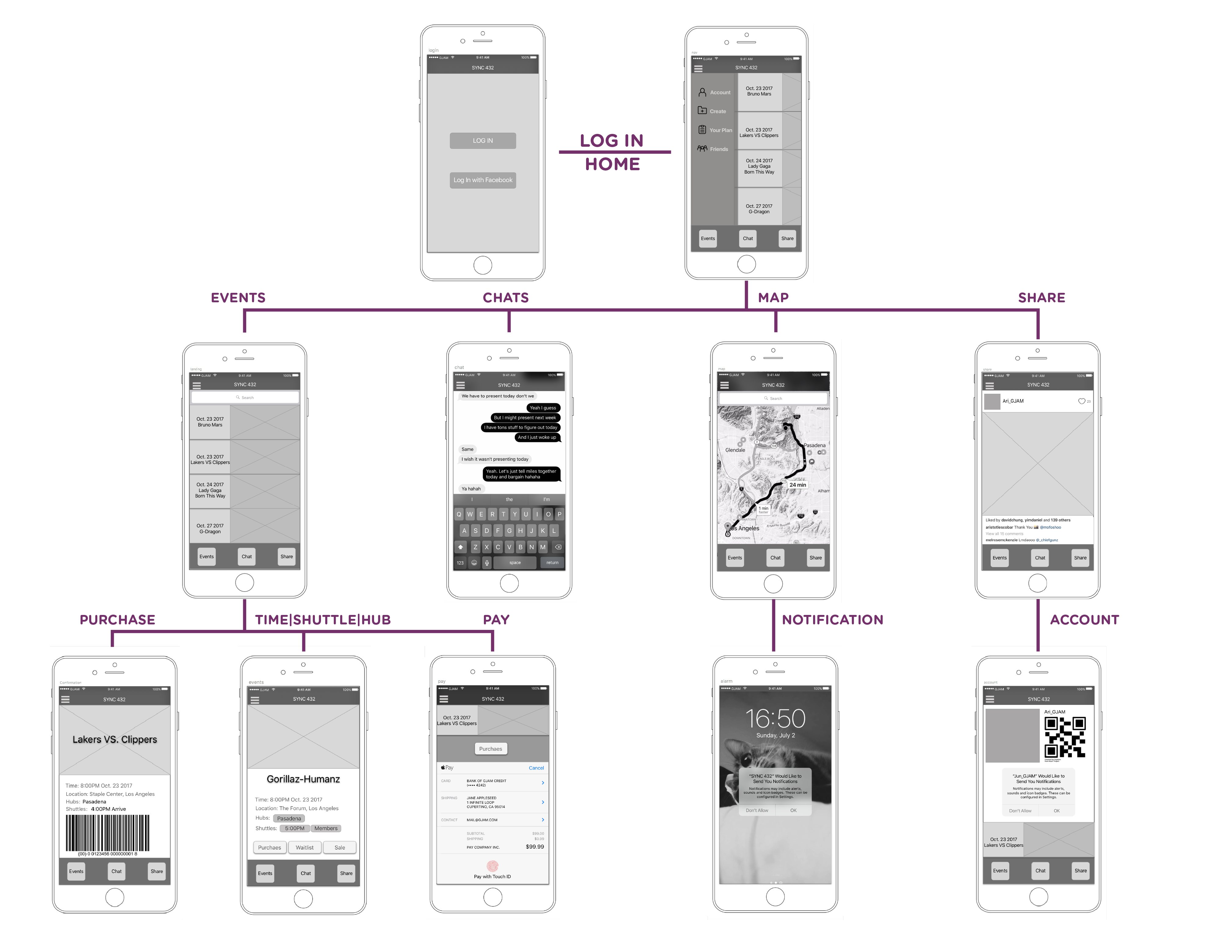
App Wireframe
App Wireframes
Iconography
Iconographic
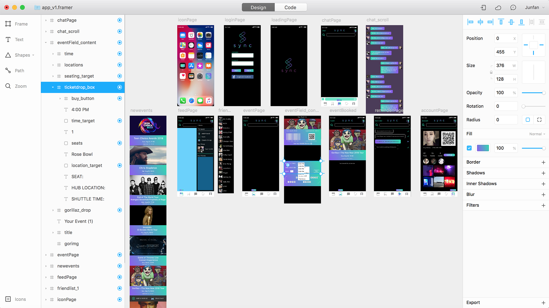
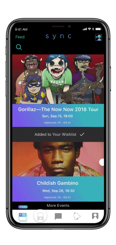
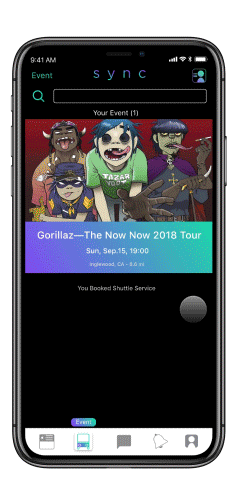
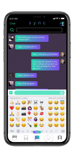
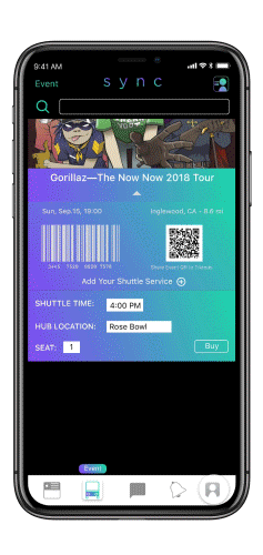
App Prototype
App Prototype
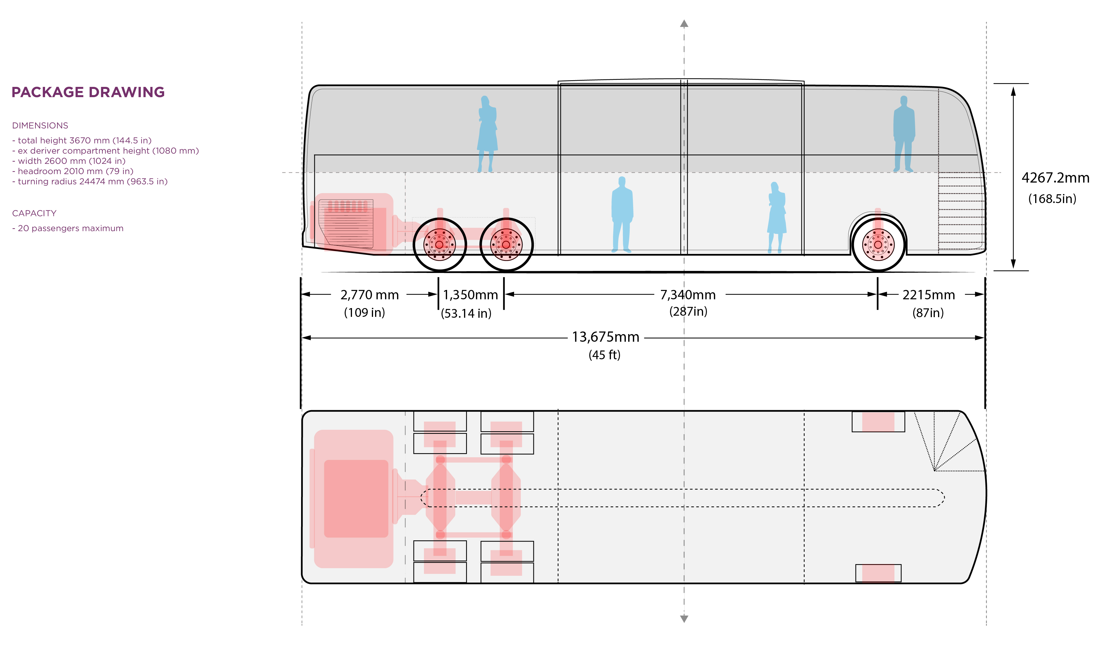
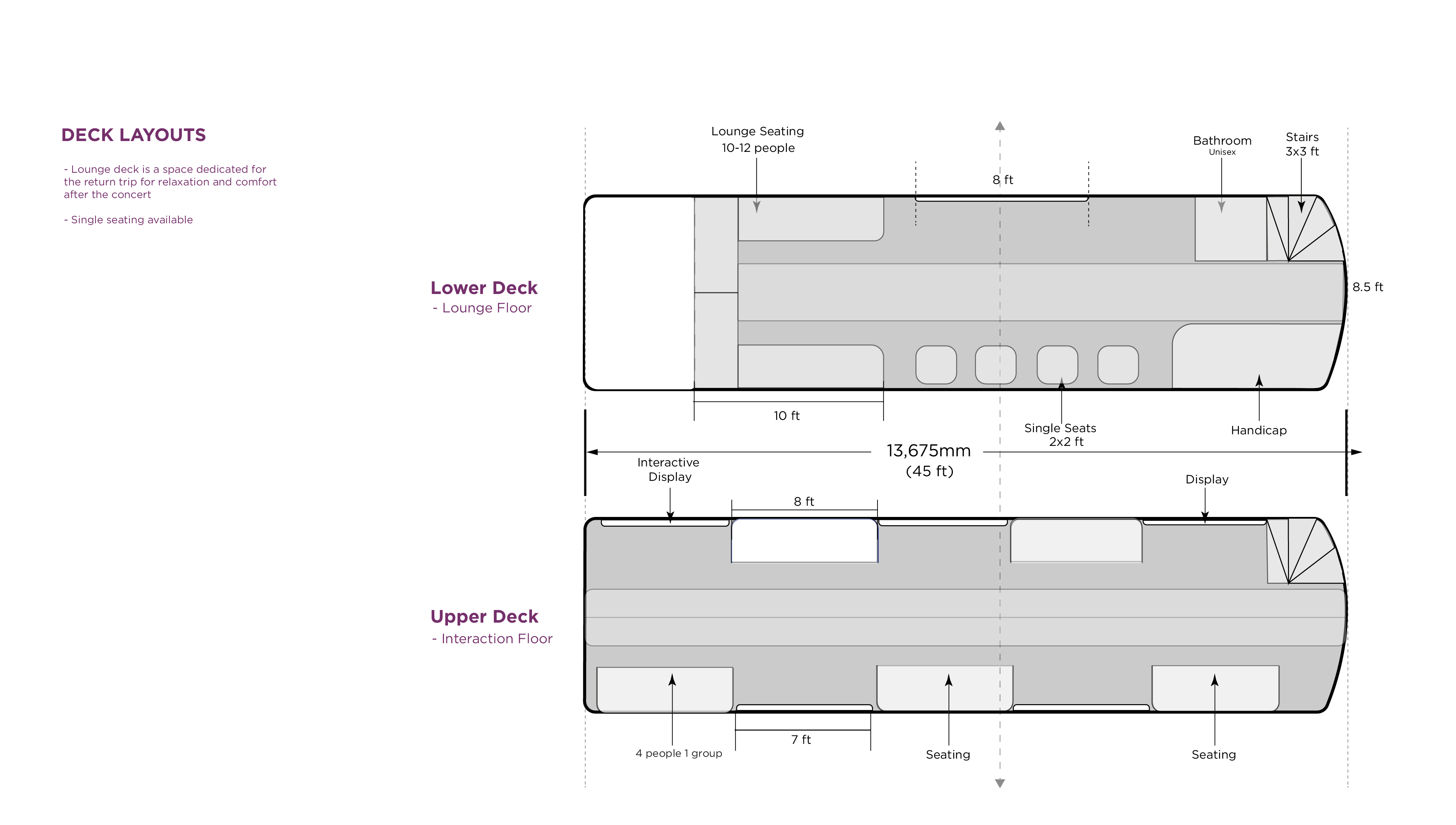
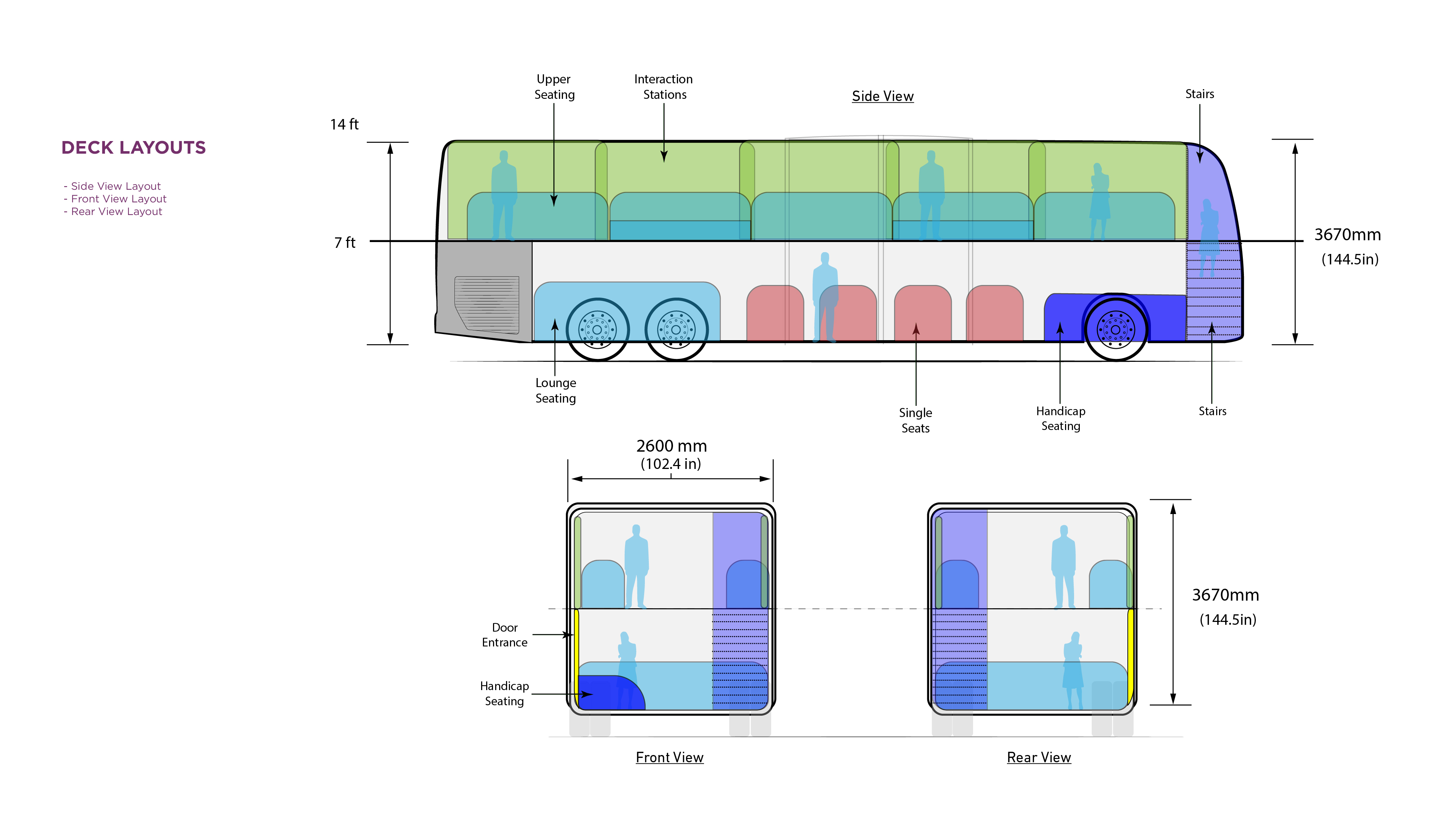
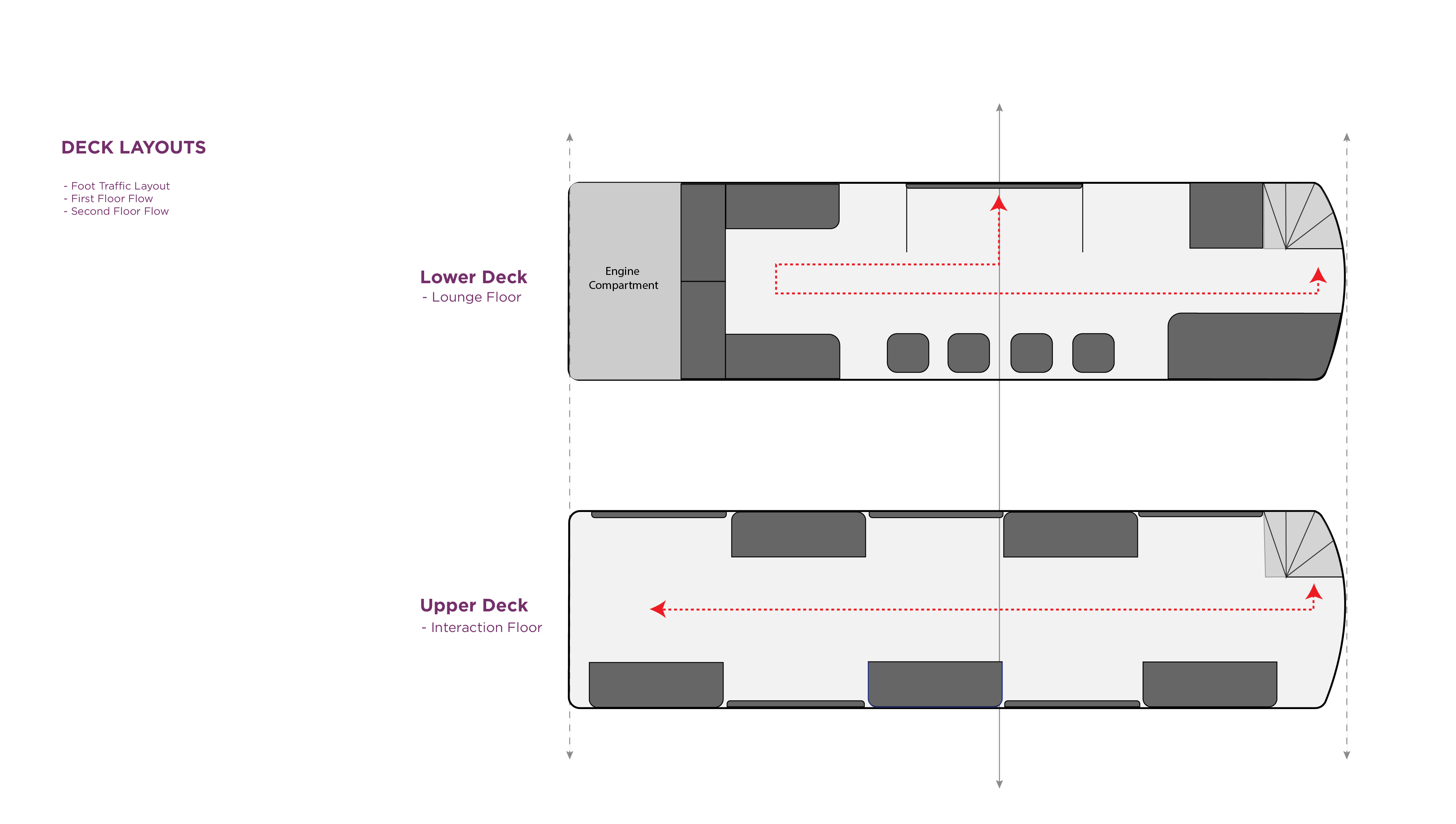
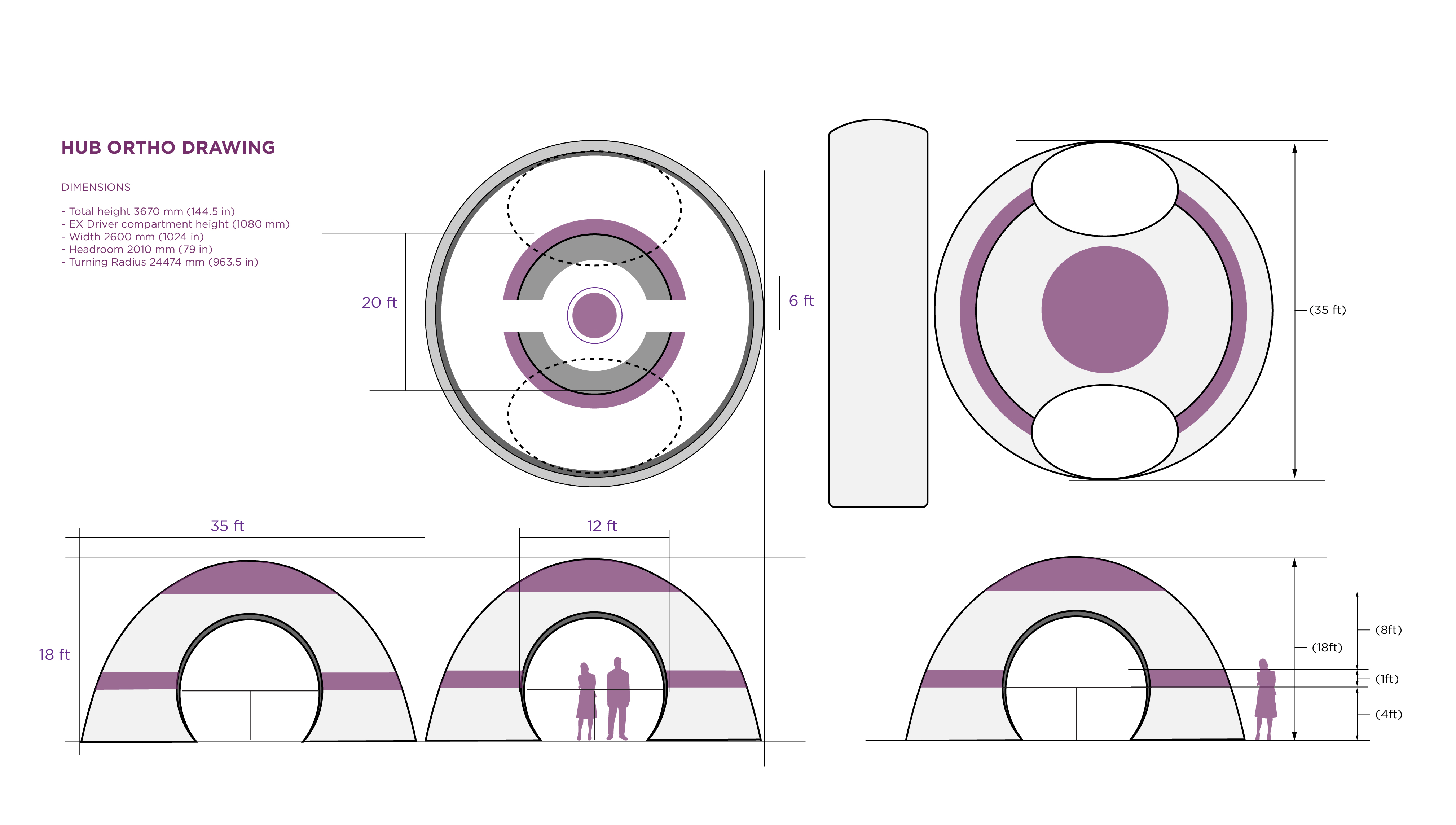
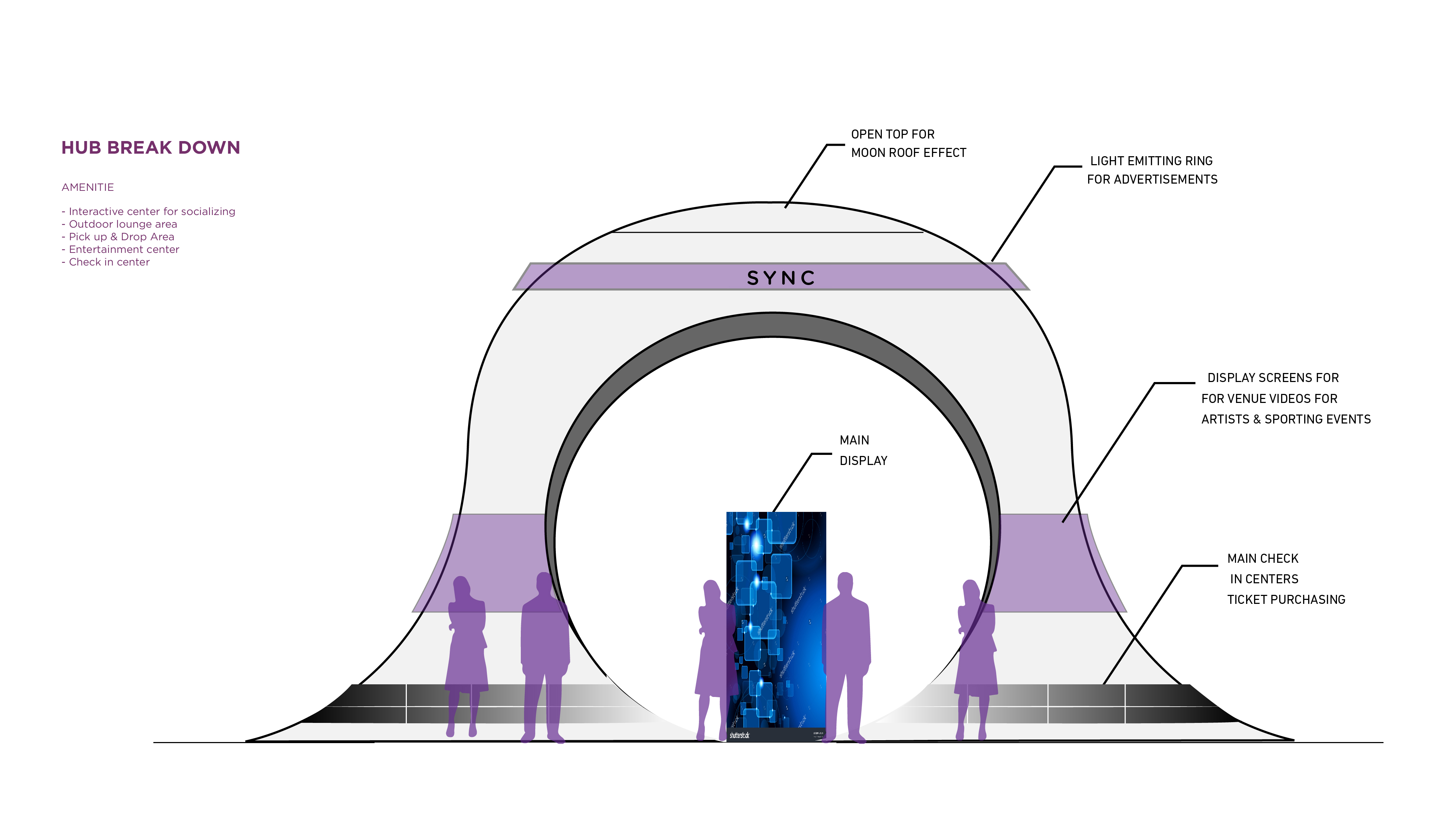
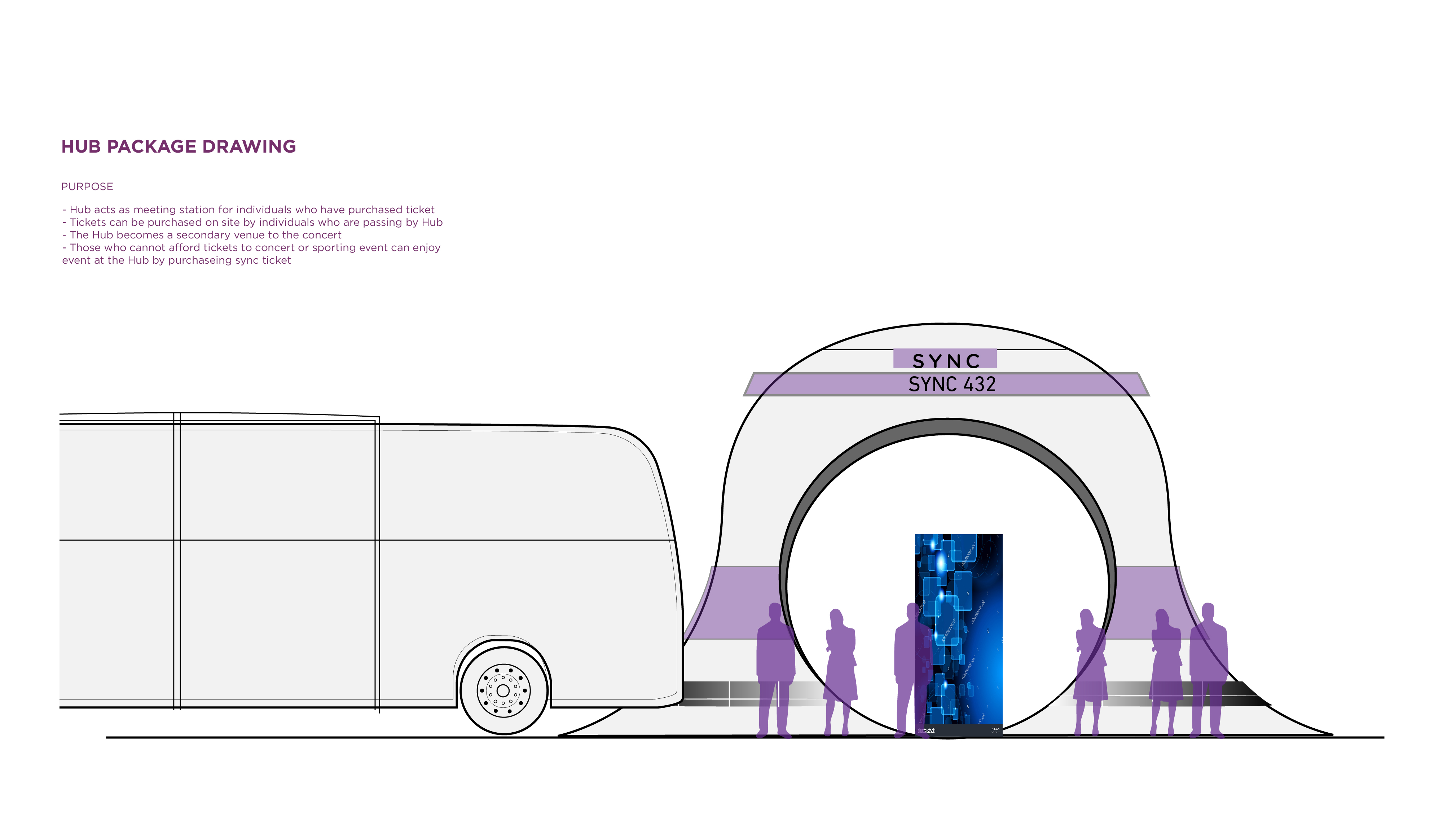
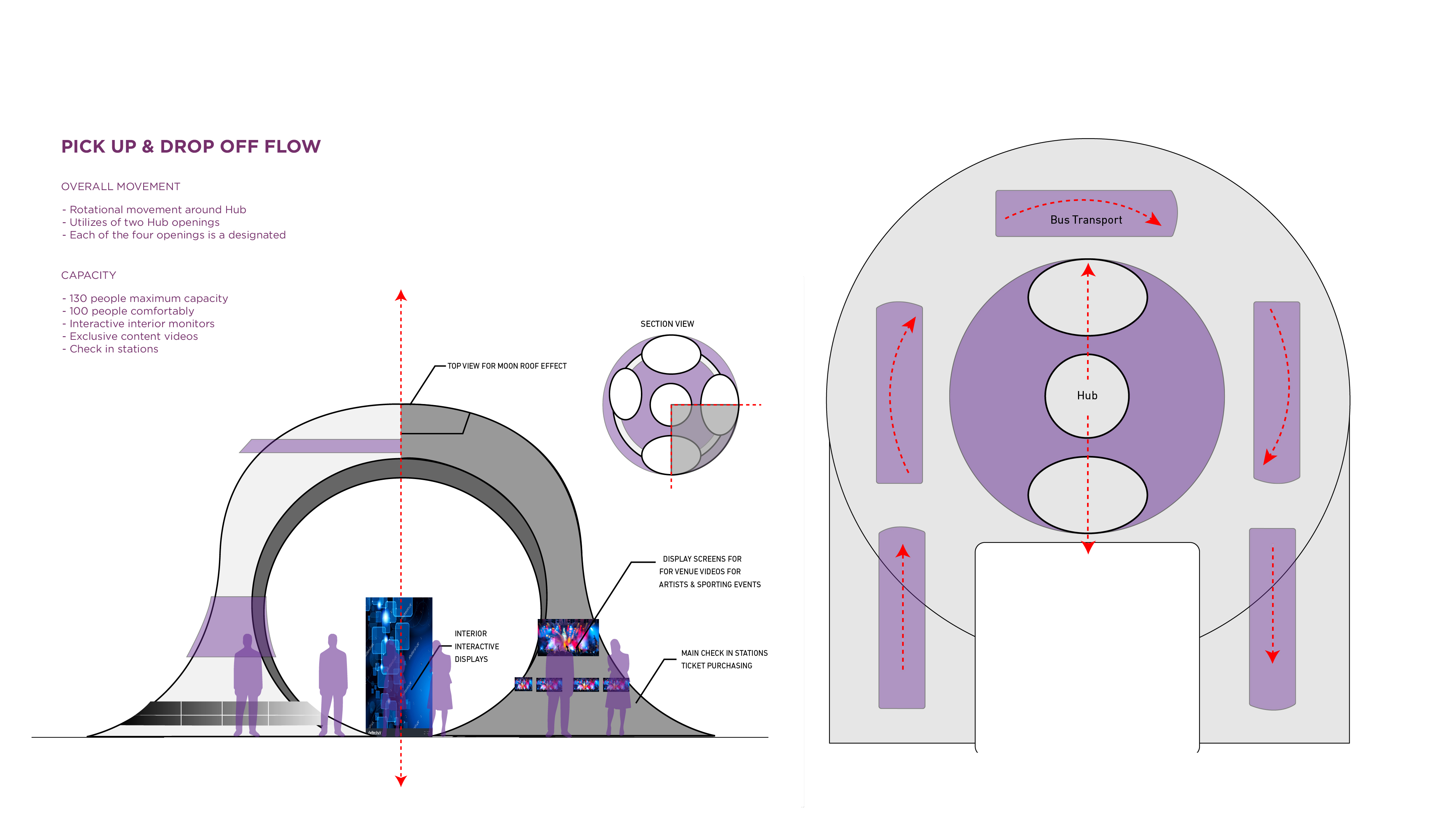
Package Drawings
Packgae Drawings
Scenario Video
Scenario Video