See's Candies Package Rebrand
See's Candies Package Rebrand
Instructor: Ania Borysiewicz
Final Photography: James Chou
Duration: May—Auguest 2018
Category: Package Design | Brand Identity | Brand Strategy | Research | Concept
Instructor: Ania Borysiewicz
Final Photography: James Chou
Duration: May—Auguest 2018
Overview:
SEE'S CANDIES is an American manufacturer and distributor of candy, particularly chocolates. SEE'S was a pioneer in the American chocolate industry, started from a little kitchen and Mary's recipes through The Great Depression and WW2, it was the first chocolate company which has door-to-door delivery and opened their chocolate kitchen to customers to look at the making of their awesome products.
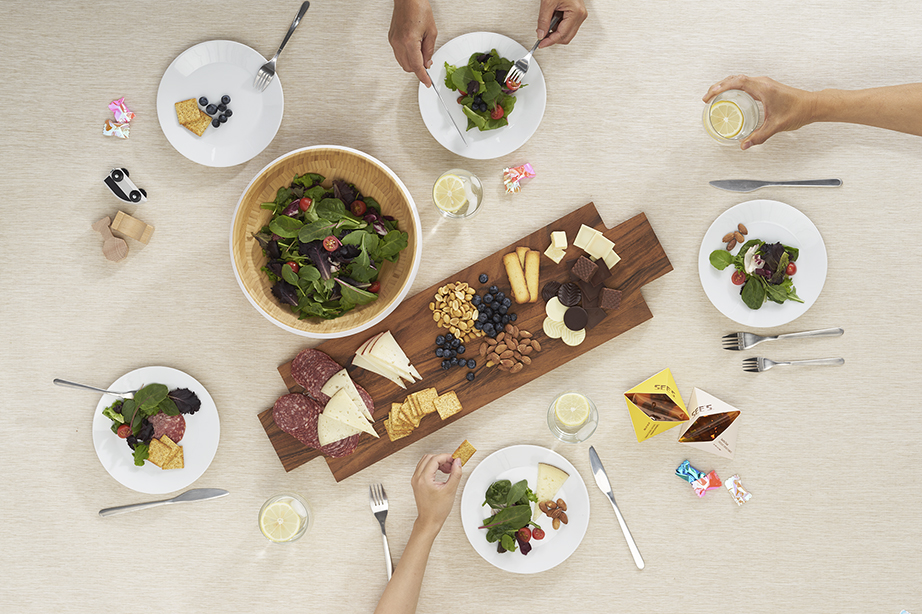
During the 14 weeks course, I was focused on creating a new concept for the new SEE'S which opens up new pop-up retail and restaurant. The new SEE'S is the place that people shares experience and conversation, where they spend quality time with their beloved. SEE'S offers healthy local ingredients to get away from modern urban speed life, slow down to enjoy the environment and foods.
Description:
SEE'S CANDIES is an American manufacturer and distributor of candy, particularly chocolates. The current SEE'S packages are mostly black and white focused colors, and too much graphics and elements are happening on their packages. The products seem inconsistent, and lacking hierarchy, so many different logos on different products.
SEE'S was a pioneer in the American chocolate industry, started from a little kitchen and Mary's recipes through The Great Depression and WW2, it was the first chocolate company which has door-to-door delivery and opened their chocolate kitchen to customers to look at the making of their awesome products.
The 14 weeks package course was focused on rebranding SEE'S brand and finding a new concept for SEE'S to be great and fresh again.
Description:
SEE'S CANDIES is an American manufacturer and distributor of candy, particularly chocolates. SEE'S was a pioneer in the American chocolate industry, started from a little kitchen and Mary's recipes through The Great Depression and WW2, it was the first chocolate company which has door-to-door delivery and opened their chocolate kitchen to customers to look at the making of their awesome products.
During the 14 weeks course, I was focused on creating a new concept for the new SEE'S which opens up new pop-up retail and restaurant. The new SEE'S is the place that people shares experience and conversation, where they spend quality time with their beloved. SEE'S offers healthy local ingredients to get away from modern urban speed life, slow down to enjoy the environment and foods.
Concept Statement
New SEE’S creates retail and restaurant spaces and experience for people to spend quality time with their beloved together. SEE’S offers healthy local ingredients to get away from modern urban speed life, really slow down to enjoy the environment and conversations. New SEE’S is also going to promote the new identity by combining the local culture of each city to open-up concept pop-up retails.
New SEE’S creates retail and restaurant spaces and experience for people to spend quality time with their beloved together. SEE’S offers healthy local ingredients to get away from modern urban speed life, really slow down to enjoy the environment and conversations. New SEE’S is also going to promote the new identity by combining the local culture of each city to open-up concept pop-up retails.
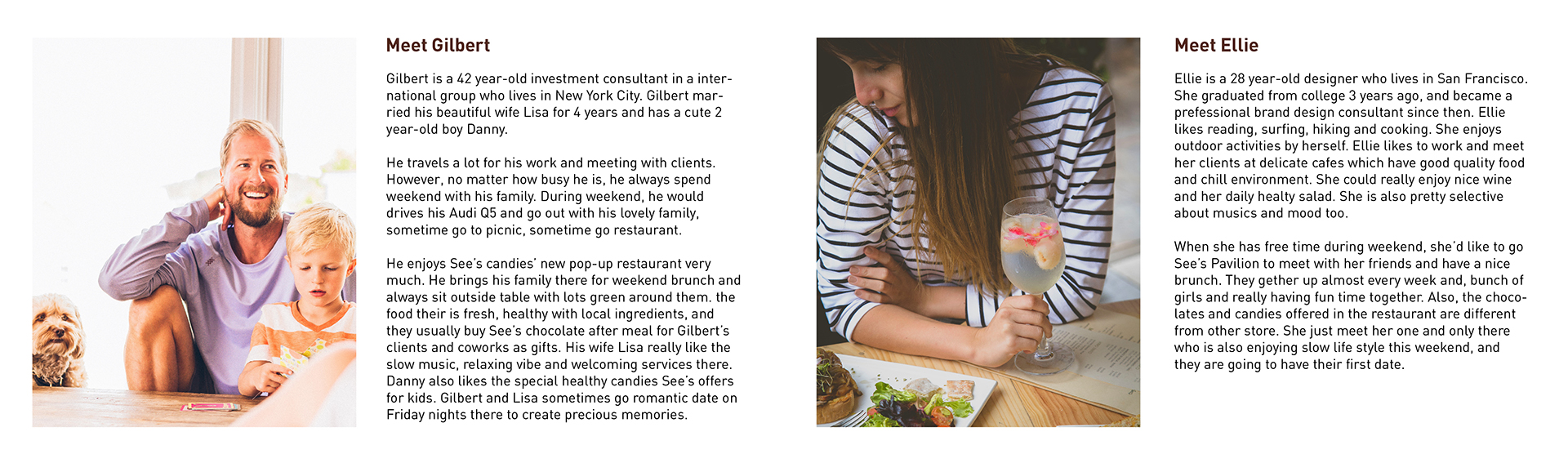
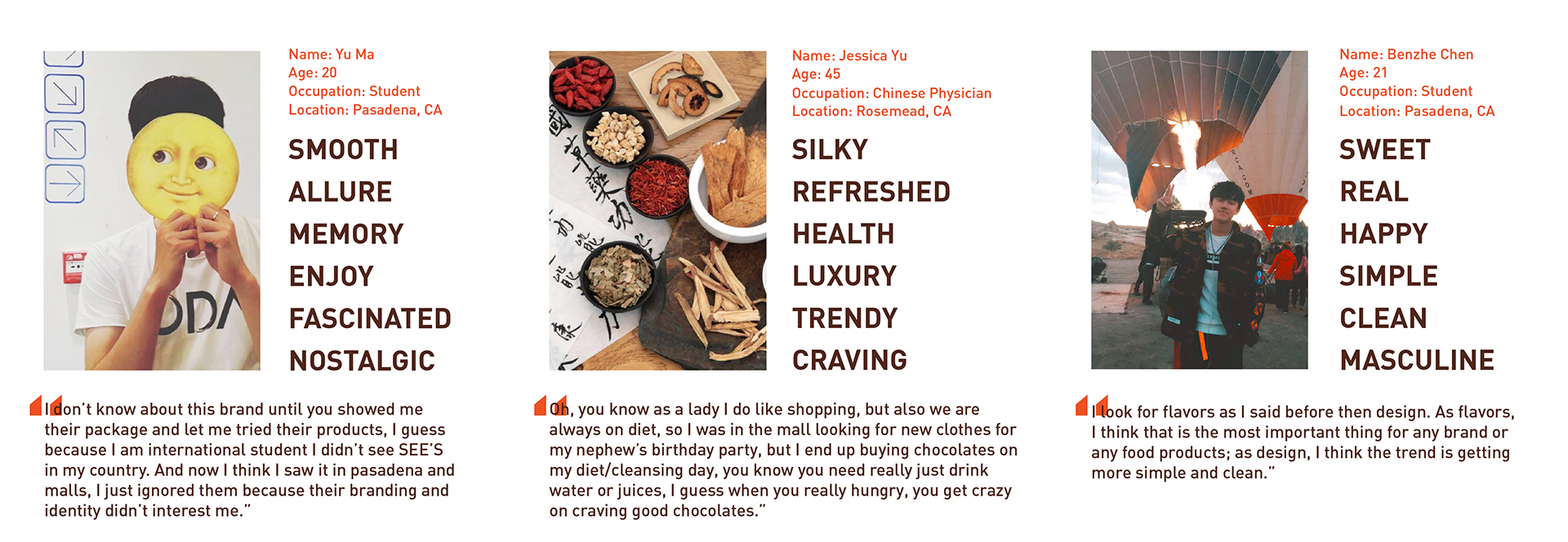
Demography
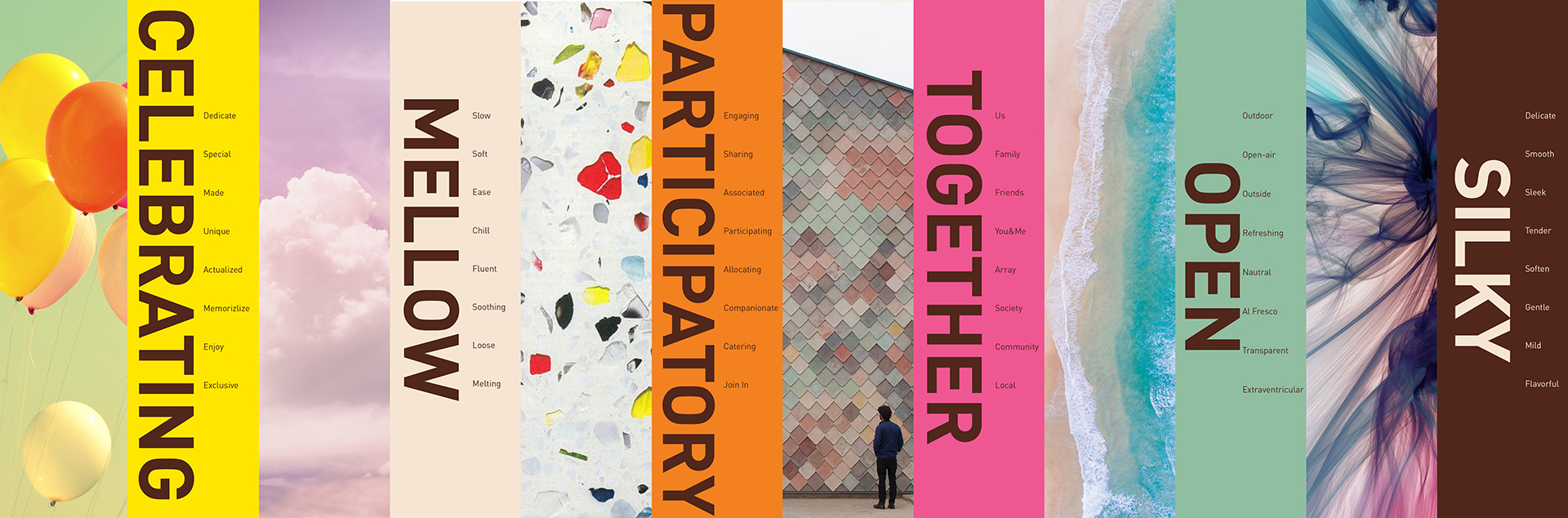
Key Attributies
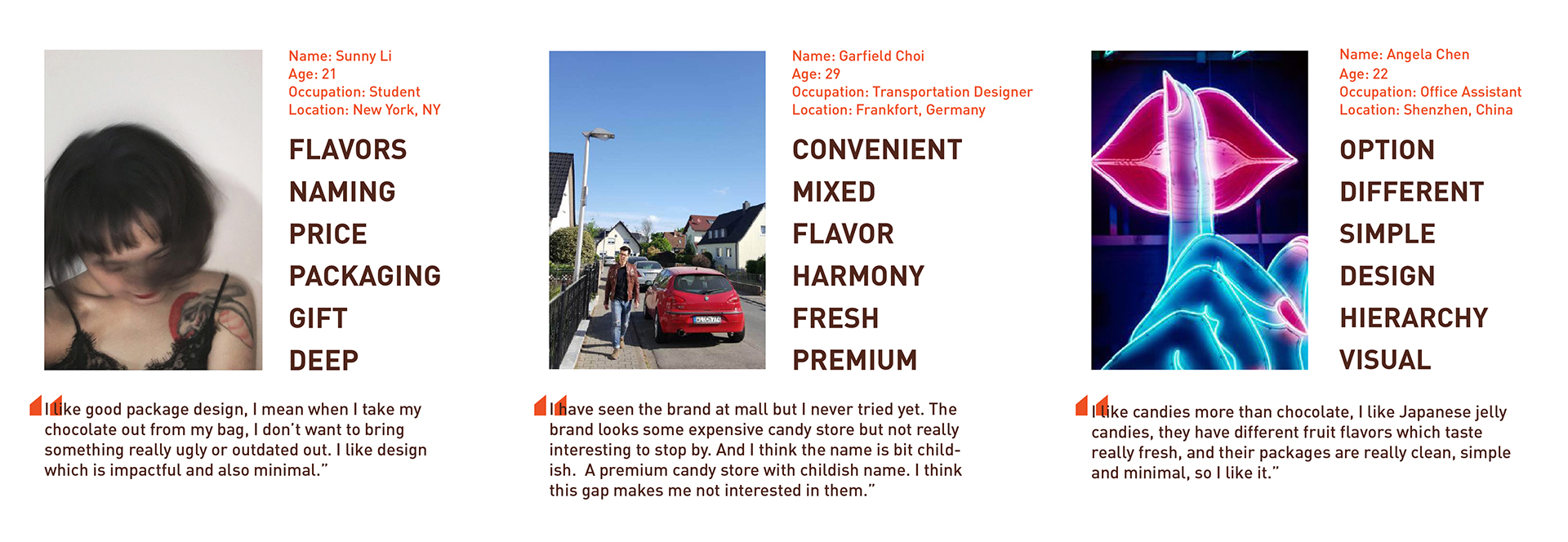
User Interviews
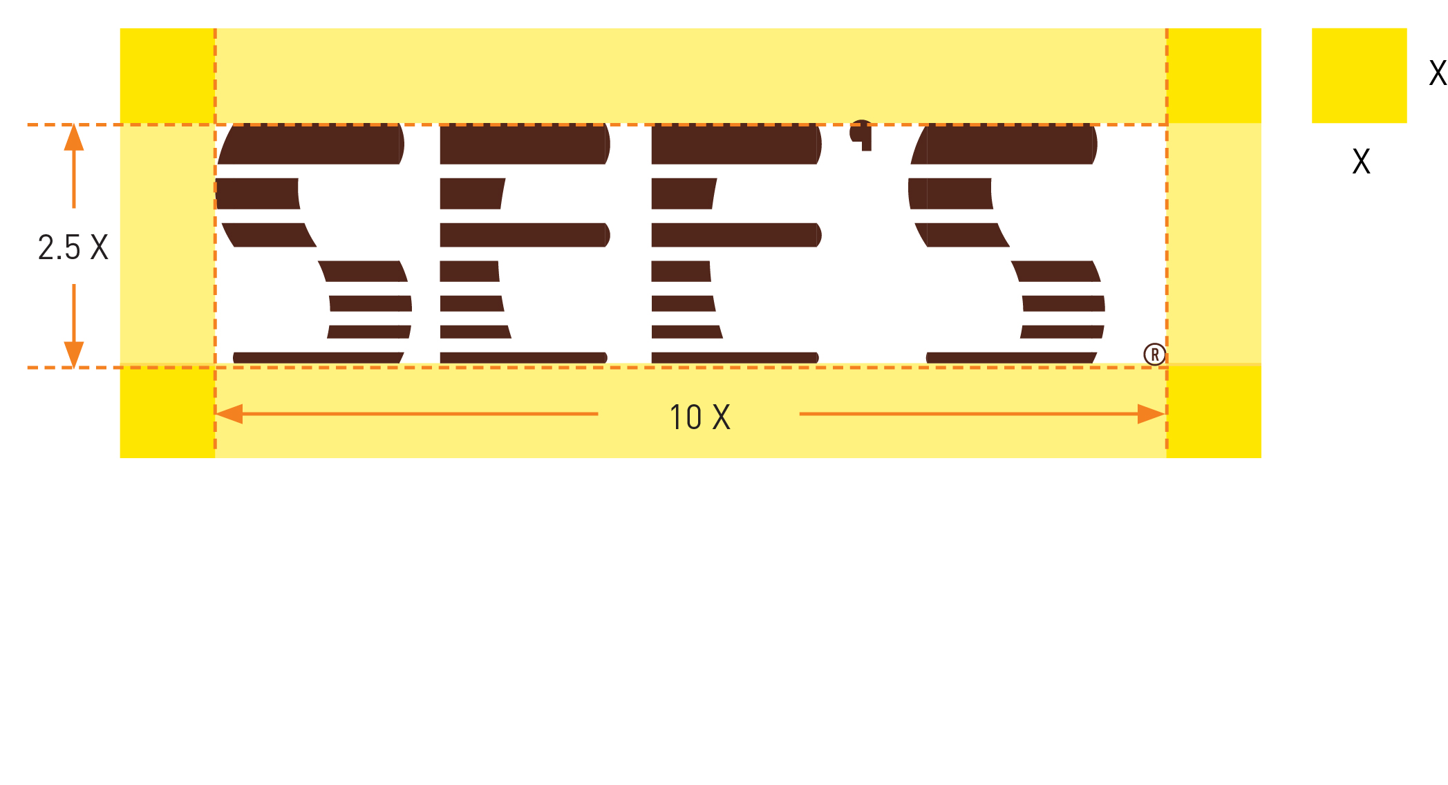
Brand Identity
The new SEE’S logo called SHADE, which inspired by modern san serif geometric typeface, the tables and seats in a busy restaurant, the volumes of noises around people, and the heat of a sunny day outside. The mark is using modular design system to show the importance of unity, how significant of all members of a family, how awesome when they all together. In addition, enjoy the environment around you, and dive into it.
The new SEE’S logo called SHADE, which inspired by modern san serif geometric typeface, the tables and seats in a busy restaurant, the volumes of noises around people, and the heat of a sunny day outside. The mark is using modular design system to show the importance of unity, how significant of all members of a family, how awesome when they all together. In addition, enjoy the environment around you, and dive into it.
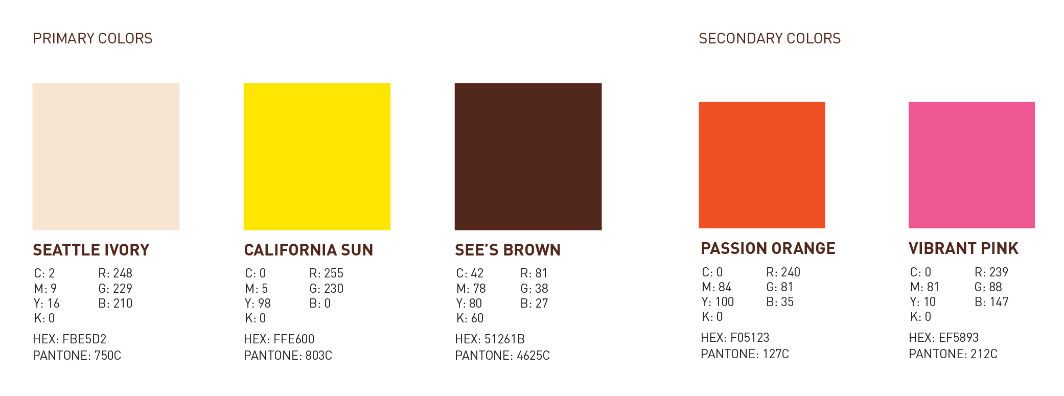
Brand Colors
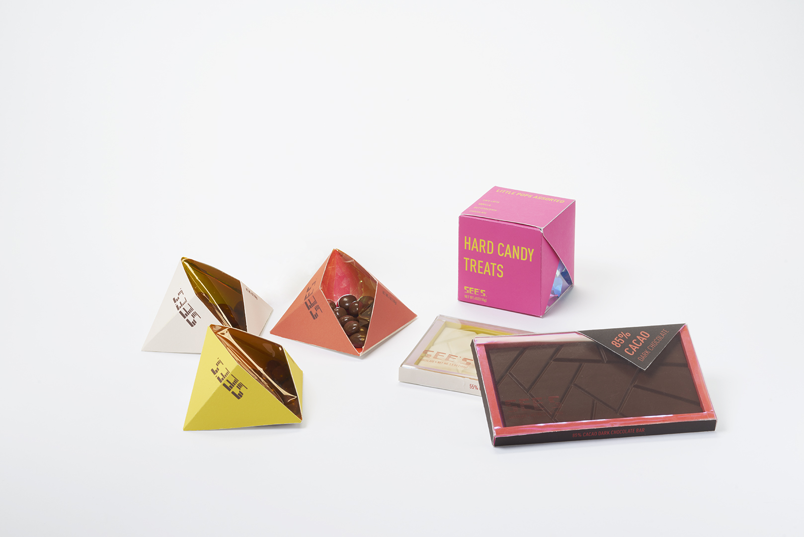
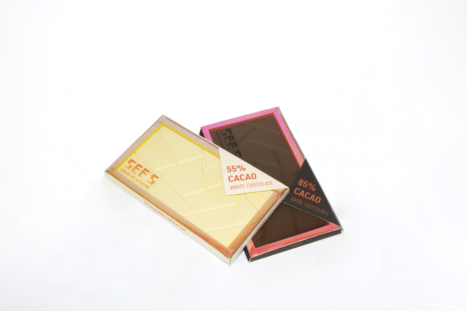
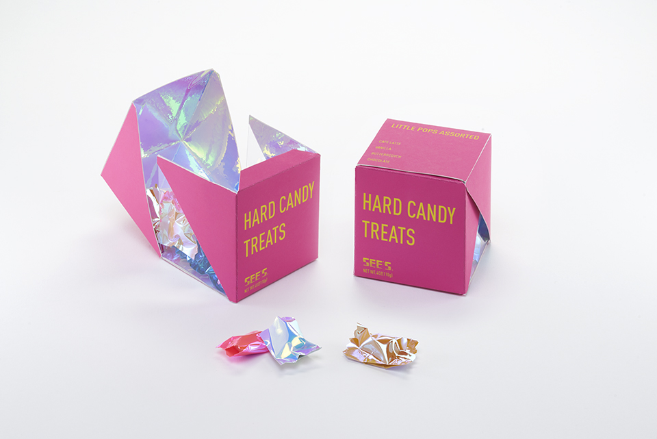
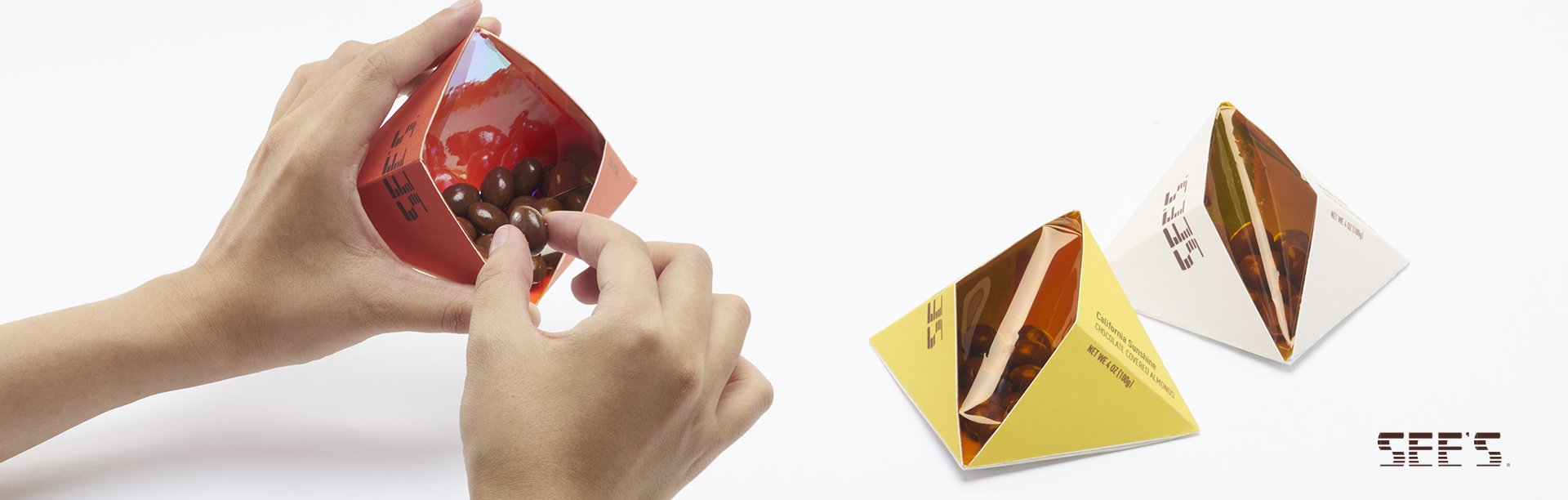
Package Design
The concept of whole package collection represents each character in families. Females are powerful, welcoming and inclusive, the males are general but tough, and the kids, colorful and lively. The whole package is emphasizing the importance of family and good time together with your beloveds.
The concept of whole package collection represents each character in families. Females are powerful, welcoming and inclusive, the males are general but tough, and the kids, colorful and lively. The whole package is emphasizing the importance of family and good time together with your beloveds.