
New Oracle Logo System
New Oracle Logo System
Category: Logos | Guideline
Director: Vu Nguyen
Role: Project lead, production, consulting, presentation
Tasks: New logo style guide and system, reduce massive amount of different styles, continue updating 300+ logos, consulting and tracking logo usage all over company.
Category: Logos | Guideline
Director: Vu Nguyen
Role: Project lead, production, consulting, presentation
Tasks: New logo style guide and system, reduce massive amount of different styles, continue updating 300+ logos, consulting and tracking logo usage all over company.
Goals: Simplify, tone, consistancy
Overview:
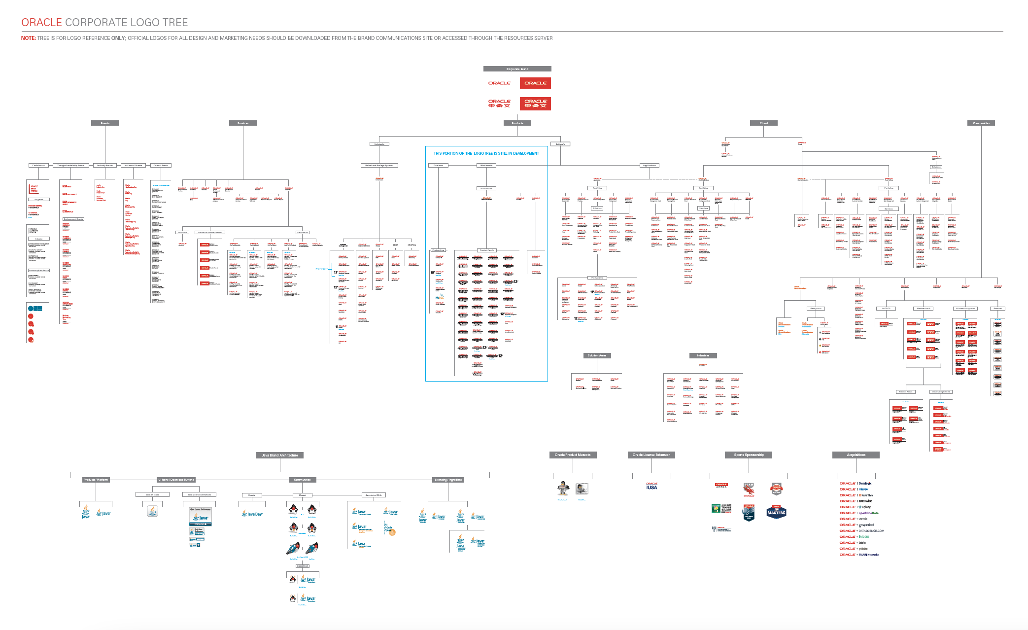
Iconic Oracle logo remains essentially unchanged, it has over 300+ logos with different systems and looks all follows their own guidelines, they lack of hierarchy and consistancy. Since 2019, the SVP and brand team worked with Dalton Maag who together made the fabulous Oracle Sans font family. Design team also came up with new Oracle Redwood color pallettes. It's time to update Oracle logo systems.
I took the project, removed the registration mark to further simplify visual presentation and the red box behind it, made the new style guide.
The Oracle logotype has been liberated from the red rectangle and its default usage is white text reversed out of a field of color. By reducing the number of separate elements and the amount of red, we hope to reduce visual noise and up-level the overall tone of our brand mark.
Overview:
Iconic Oracle logo remains essentially unchanged, it has over 300+ logos with different systems and looks all follows their own guidelines, they lack of hierarchy and consistancy. Since 2019, the SVP and brand team worked with Dalton Maag who together made the fabulous Oracle Sans font family. Design team also came up with new Oracle Redwood color pallettes. It's time to update Oracle logo systems.
I took the project, removed the registration mark to further simplify visual presentation and the red box behind it, made the new style guide.
The Oracle logotype has been liberated from the red rectangle and its default usage is white text reversed out of a field of color. By reducing the number of separate elements and the amount of red, we hope to reduce visual noise and up-level the overall tone of our brand mark.
Before Redwood
Before the update of the logo system, Oralce has a lot of different logo styles and guidelines, which are lacking of hierarchy and structures. And the Oralce signature logos with red box behind them are not working anymore.
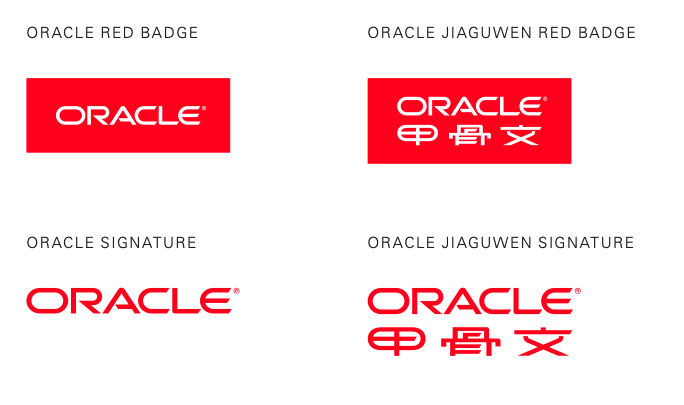

New Product & Services Lock-up
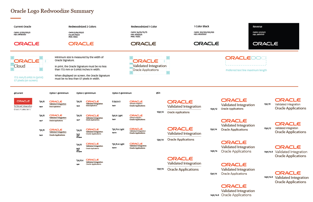
The minimum size of the Oralce logo is measured by the width of Oracle Signature. In print, the Oracle Signature must be no less than 17.5 mm or 0.6965 inches in width. When displayed on screen, the Oracle Signature must be no less than 57 pixels in width.
The minimum clear space to the left and right is equal to the cap height of the letter O.
The clear space above and below the logo is equal to the height of the letter O.
The length of logo text should not be longer than 3 letter O.
The red logo is the primary choice and to be used when possible (depending on ADA).
Use the Black or Bark when limited to one color printing application.
The reversed/white logo can be use on red or darker backgrounds (depending on ADA).
Logo Color Usage
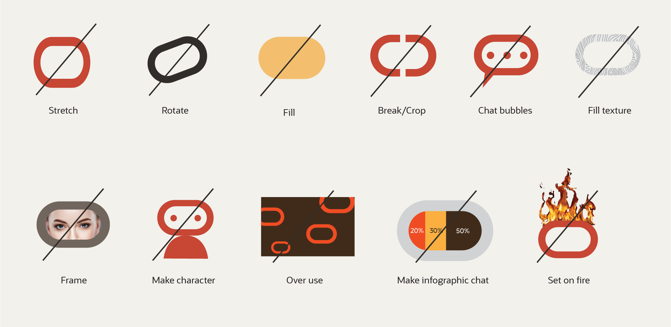
The "O"
The "O" graphic originates from the letter O in the Oracle logo. You may use it as a supporting element to reinforce ir provide a quick visual nod to the brand.
Like the "O" tag, it is not our official logo and shouldn't be used as a standalone element (with current exceptions of its use in the oracle.com navigation bar and my.oracle.com landing page ). Whenever you use the "O" graphic, either the Oracle logo or the word "Oracle" should appear within the same experience.
As a component of the Oracle brand, the "O" should be used in a consistent, mindful, and respectful manner. Always consider where, how, and why you are using it, as well as its relationship to other visual elements in your layout. Never embellish, modify, or treat the "O" as a graphic novelty.

Current exception of its use in the oracle.com navigation bar.
Acceptable colors
Don'ts


Oracle Red
Oracle Bark
Reversed/White
"O" tag
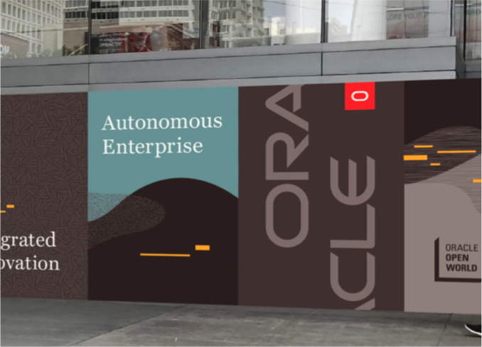
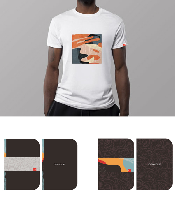
The "O" tag is a signature element in the Oracle design language that may be leveraged in digital and analog marketing, as well as in our next-generation product user experiences.
Always position the "O" tag in the bottom right cornoer of the collateral asset or experience. Refer to the width if the tag to create a margin or padding between the right of the tag and the outer right edge.
There may be times when it's not possible to place the tag in the bottom right position. In those cases, you may place it in the top right corner with a padding/margin between the tag and right edge that matches the width of the tag.
The "O" tag is not a replacement for the offical Oracle logo.
Always use at first instance with the full Oracle logo.
There us an exception for the "O" tag guidelines for social media assets that exists on Oracle's own channel/site. The "O" tag can exist by itself without any additional Oracle logo to avoid redundancy.

Avoid using the "O" tag alone. include the full Oracle logo or "Oracle" spelled out in the accompanying content within the design layout or collateral asset.
If placing the tag in the bottom right placement is not feasible, position the tag in the upper right corner.
"O" tag examples

New Partnernetwork Logos
Partnernetwork logo lock-up
Logo explorations
New Acquisition Logos
Use tge aquired company logo word mark without icon or graphic.
Minimum size of acquisition logo is measured by the width of acquitition horizontal logo. In print, the logo must be no less than 17.5 mm or 0.6965 inches in width. When displayed on screen, the logo must be no less than 57 pixels in width. Size of "an Oracle company" is set to 11pt as the base line scale.
Clear space is the x-height of Oracle Sans.
Aquired word mark should in Oracle Bark, the "an Oracle company" uses the Oracle Red for "Oracle", the Oracle Bark for "an company". We also removed existing ® or ™.
Logo color usage
Updated logos
ACE Program Logos
The Oracle ACE Program recognizes excellence in the global Oracle technology and application community. One becomes eligible by sharing IT knowledge and experience, and by meeting official criteria.
The Oracle ACE logo gives qualified professionals a way to indicate their achievement. It may by used in various communications, including e-mail signatures, printed collateral, electronic messaging, business cards, and websites.
The following designations may be used in reference to the program and to your designated status: Oracle ACE, Oracle ACE Director, Oracle ACE Associate, Oracle ACE Alumni.
The Oracle ACE Program color palette consists of Oracle Red, Oracle Bark, Oracle ACE Director Gold, and Oracle ACE Associate Grey. There are also single bark color, or black-and-white (one color) options for specific applications, such as budget print.
Updated logos
Don'ts