Defenders of Wildlife Rebrand
Category: Brand Identity | Brand Strategy | Research | Concept
Instructor: Gerardo Herrera
Duration: May—Auguest 2017
Category: Brand Identity | Brand Strategy | Research | Concept
Instructor: Gerardo Herrera
Duartion: May—Auguest 2017
Category: Brand Identity | Brand Strategy | Research | Concept
Instructor: Gerardo Herrera
Duartion: May—Auguest 2017
Overview:
Defenders of Wildlife is a national, nonprofit membership organization dedicated to the protection of all native wild animals and plants in their natural communities.
During the 14 weeks course, I was focused on giving the Defenders newer, powerful, flexible, and younger brand visual by targeting a more younger audience than they have right now which most donators are over 60 years old. I revisioned its logo and other visual elements to help it stand out from its competitors.
Description:
Defenders of Wildlife is a national, nonprofit membership organization dedicated to the protection of all native wild animals and plants in their natural communities.
During the 14 weeks course, I was focused on giving the Defenders newer, powerful, flexible, and younger brand visual by targeting a more younger audience than they have right now which most donators are over 60 years old. I revisioned its logo and other visual elements to help it stand out from its competitors.
Brand Mission
Brand Steering Wheel
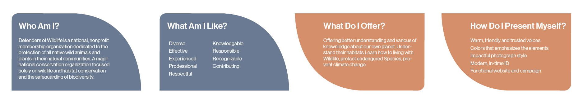
Brand Values

New Brand Identity
Design Concept
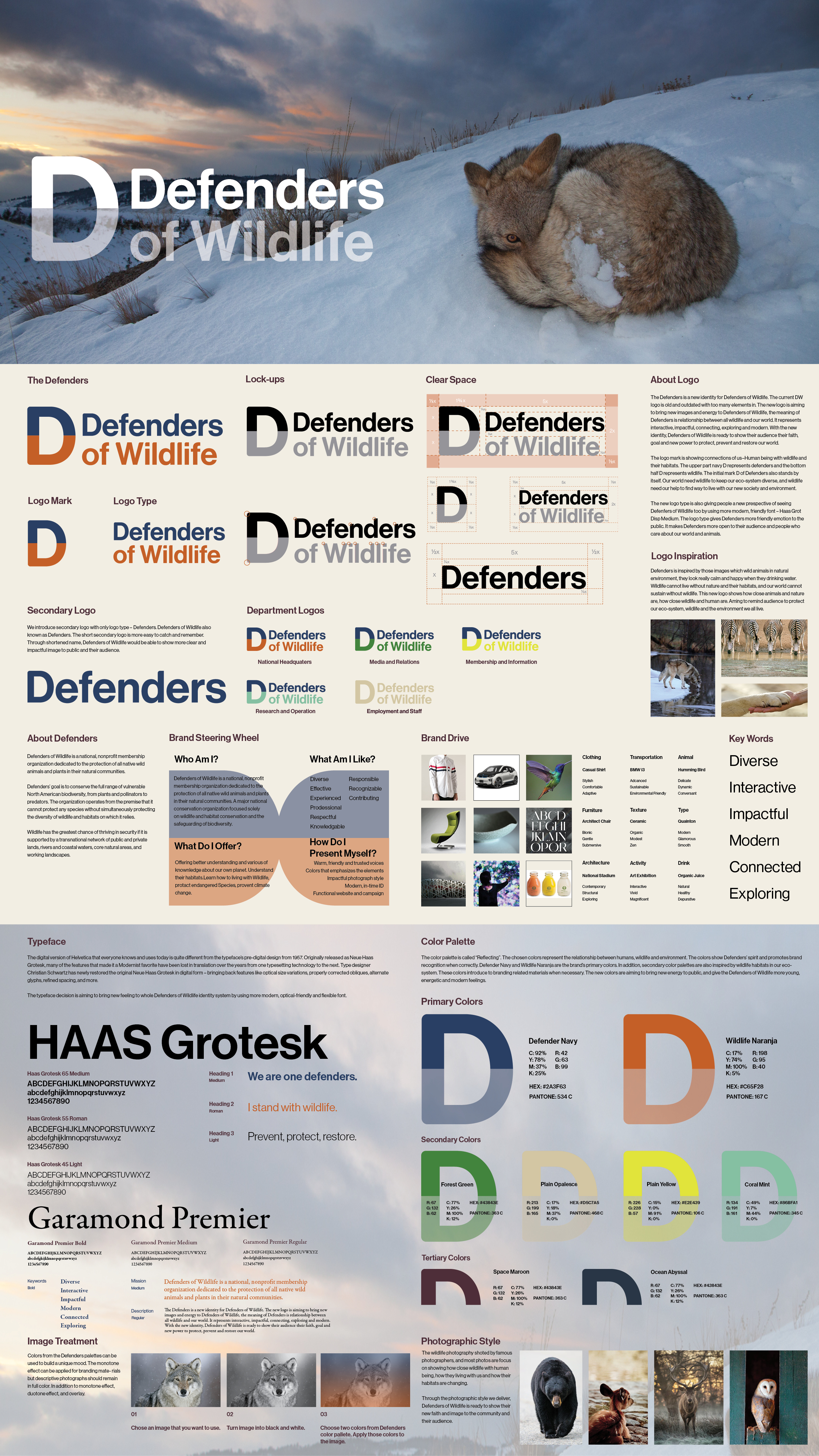
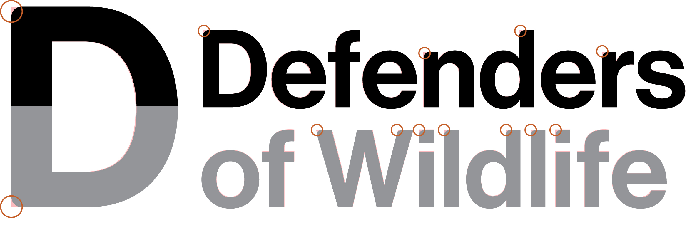
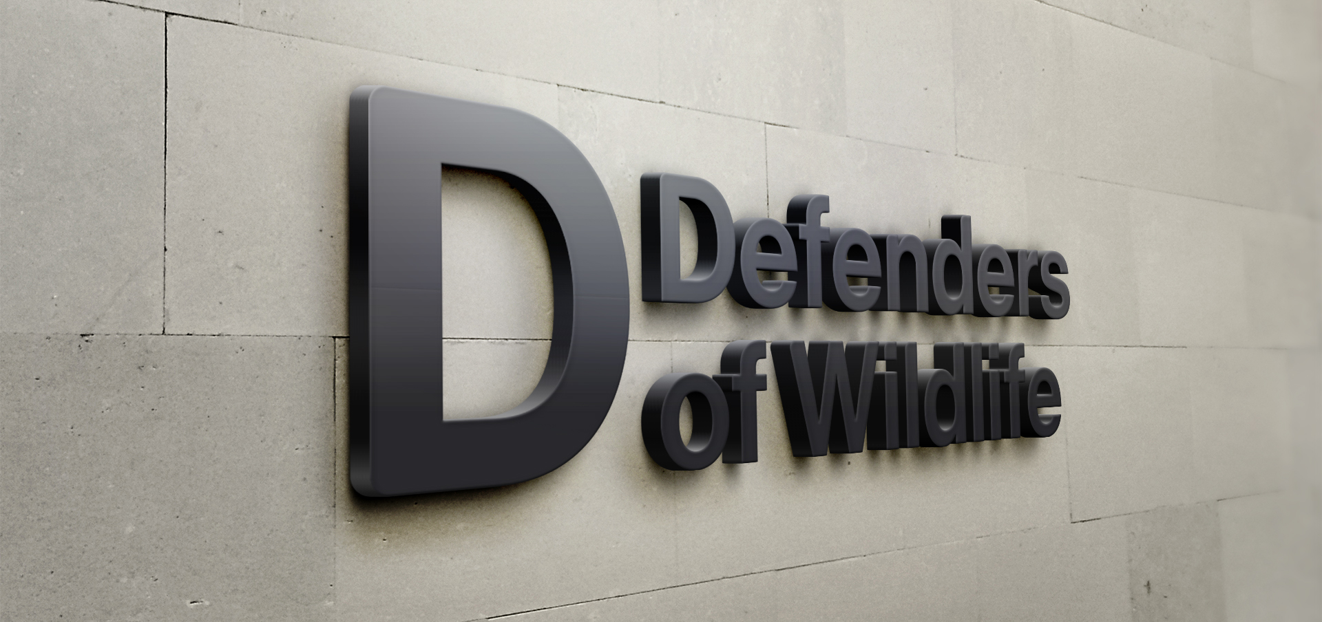
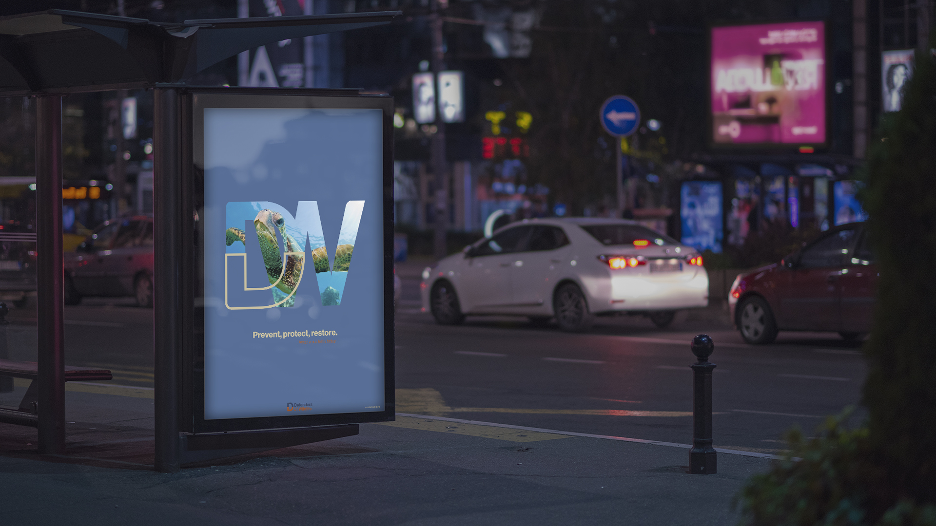
The Defenders is a new identity for Defenders of Wildlife. The current DW logo is outdated and complicated with too many elements in. The new logo is aiming to bring new images and energy to Defenders of Wildlife, the meaning of Defenders is the relationship between all wildlife and our world. It represents interactive, impactful, connecting, exploring and modern. With the new identity, Defenders of Wildlife is ready to show their audience their faith, goal and new power to protect, prevent and restore our world.
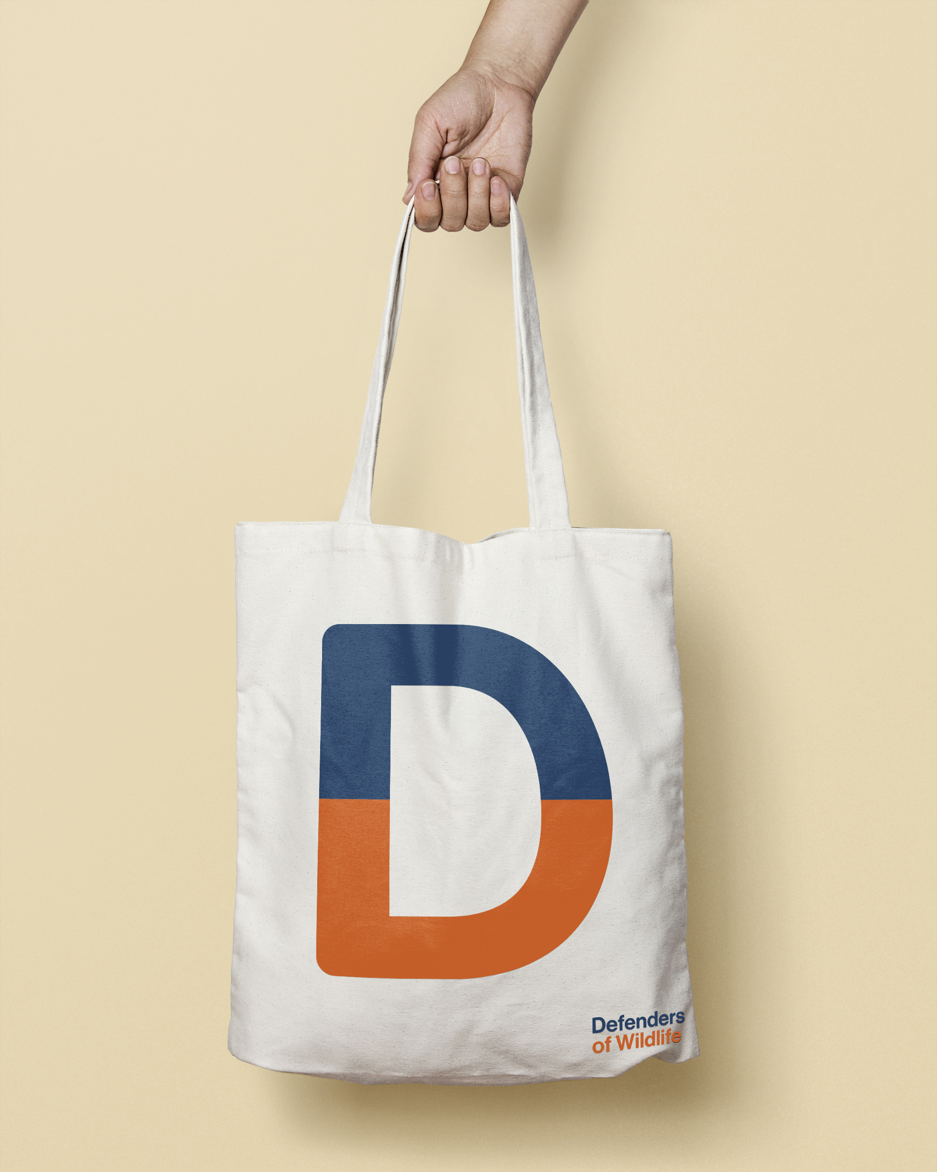
The logo mark is showing connections of us – Human being with wildlife and their habitats. The upper part of the logo is navy D represents defenders and the bottom half D represents wildlife. The initial mark D of Defenders also stands by itself. Our world needs wildlife to keep our eco-system diverse, and wildlife needs our help to find a way to live with our new society and environment.
The new logotype is also giving people a new perspective of seeing Defenders of Wildlife too by using the more modern, friendly font – Haas Grotesk Medium. The logotype gives Defenders more friendly emotion to the public. The left angle modified to the rounded shape to show the protection work as a defender, It makes Defenders more open to their audience and people who care about our world and animals.
Design Concept
The Defenders is a new identity for Defenders of Wildlife. The current DW logo is outdated and complicated with too many elements in. The new logo is aiming to bring new images and energy to Defenders of Wildlife, the meaning of Defenders is relationship between all wildlife and our world. It represents interactive, impactful, connecting, exploring and modern. With the new identity, Defenders of Wildlife is ready to show their audience their faith, goal and new power to protect, prevent and restore our world.
The logo mark is showing connections of us – Human being with wildlife and their habitats. The upper part navy D represents defenders and the bottom half D represents wildlife. The initial mark D of Defenders also stands by itself. Our world need wildlife to keep our eco-system diverse, and wildlife need our help to find way to live with our new society and environment.
The new logo type is also giving people a new perspective of seeing Defenders of Wildlife too by using more modern, friendly font – Haas Grotesk Medium. The logo type gives Defenders more friendly emotion to the public. It makes Defenders more open to their audience and people who care about our world and animals.
Design Concept
The Defenders is a new identity for Defenders of Wildlife. The current DW logo is outdated and complicated with too many elements in. The new logo is aiming to bring new images and energy to Defenders of Wildlife, the meaning of Defenders is a relationship between all wildlife and our world. It represents interactive, impactful, connecting, exploring and modern. With the new identity, Defenders of Wildlife is ready to show their audience their faith, goal and new power to protect, prevent and restore our world.
The logo mark is showing connections of us – Human being with wildlife and their habitats. The upper part of navy D represents defenders and the bottom half D represents wildlife. The initial mark D of Defenders also stands by itself. Our world needs wildlife to keep our eco-system diverse, and wildlife needs our help to find a way to live with our new society and environment.
The new logotype is also giving people a new perspective of seeing Defenders of Wildlife too by using a more modern, friendly font – Haas Grotesk Medium. The logotype gives Defenders more friendly emotion to the public. It makes Defenders more open to their audience and people who care about our world and animals.
Logo Inspiration
New Defenders is inspired by those images which wild animals in the natural environment, they look really calm and happy when they drinking water. Wildlife cannot live without nature and their habitats, and our world cannot sustain without wildlife. This new logo shows how close animals and nature are, how close wildlife and human are. Arming to remind the audience to protect our eco-system, wildlife and the environment we all live.
Logo Inspiration
The Defenders is inspired by those images which wild animals in the natural environment, they look really calm and happy when they drinking water. Wildlife cannot live without nature and their habitats, and our world cannot sustain without wildlife. This new logo shows how close animals and nature are, how close wildlife and human are. Arming to remind the audience to protect our eco-system, wildlife and the environment we all live.
Logo Animation
Modified Logotype

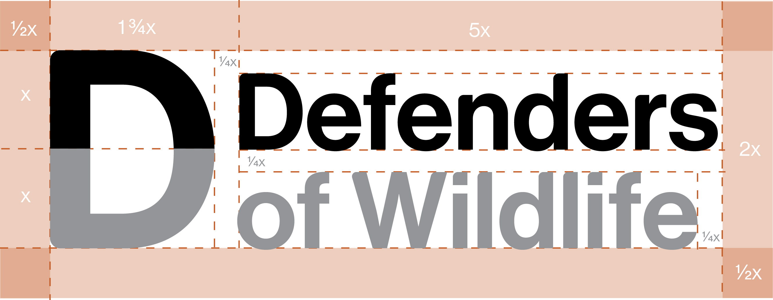
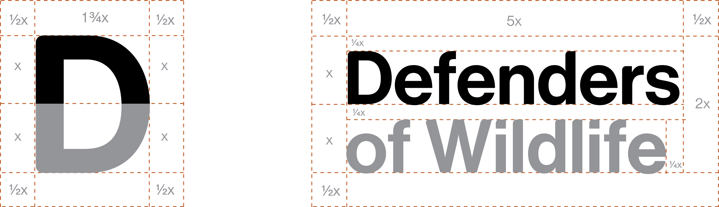
Logo Lock-up | Logo Clear Zone
Logo Lock-up | Clear Space
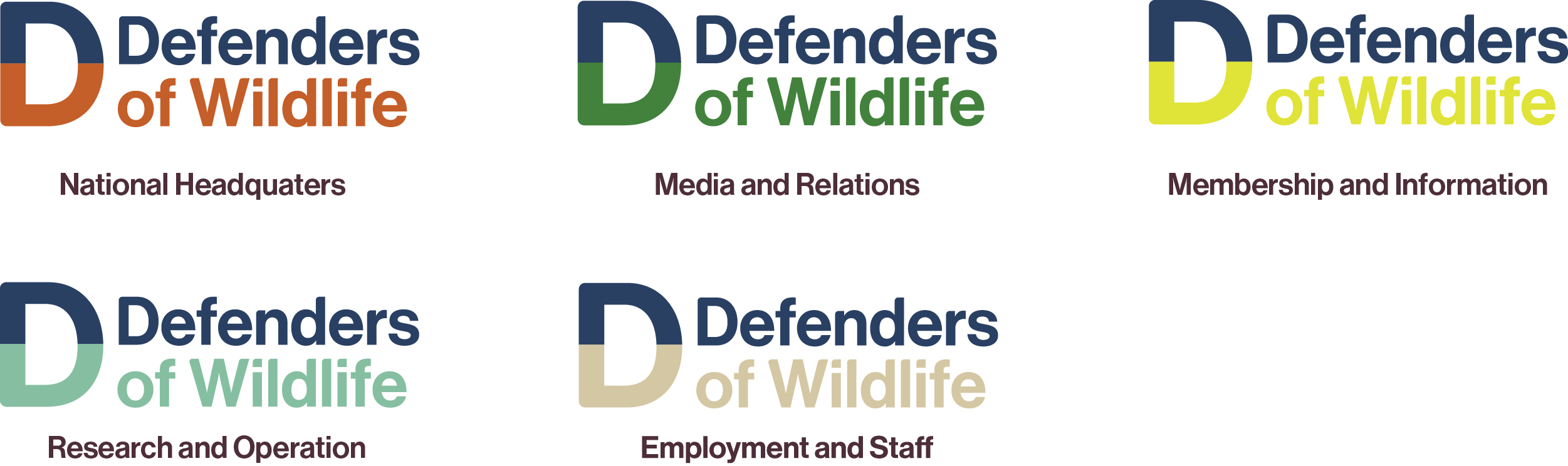
Logos of Subsidiaries
Logos of Subsidiaries
Secondary Logo
I introduce the secondary logo with only the logotype — Defenders. Defenders of Wildlife also known as Defenders. The short secondary logo is more easy to catch and remember to the audience. Through shortened name, Defenders of Wildlife would be able to show a clearer and impactful image to the public.
I introduce the secondary logo with only the logotype — Defenders. Defenders of Wildlife also known as Defenders. The short secondary logo is more easy to catch and remember to the audience. Through shortened name, Defenders of Wildlife would be able to show a clearer and impactful image to the public.
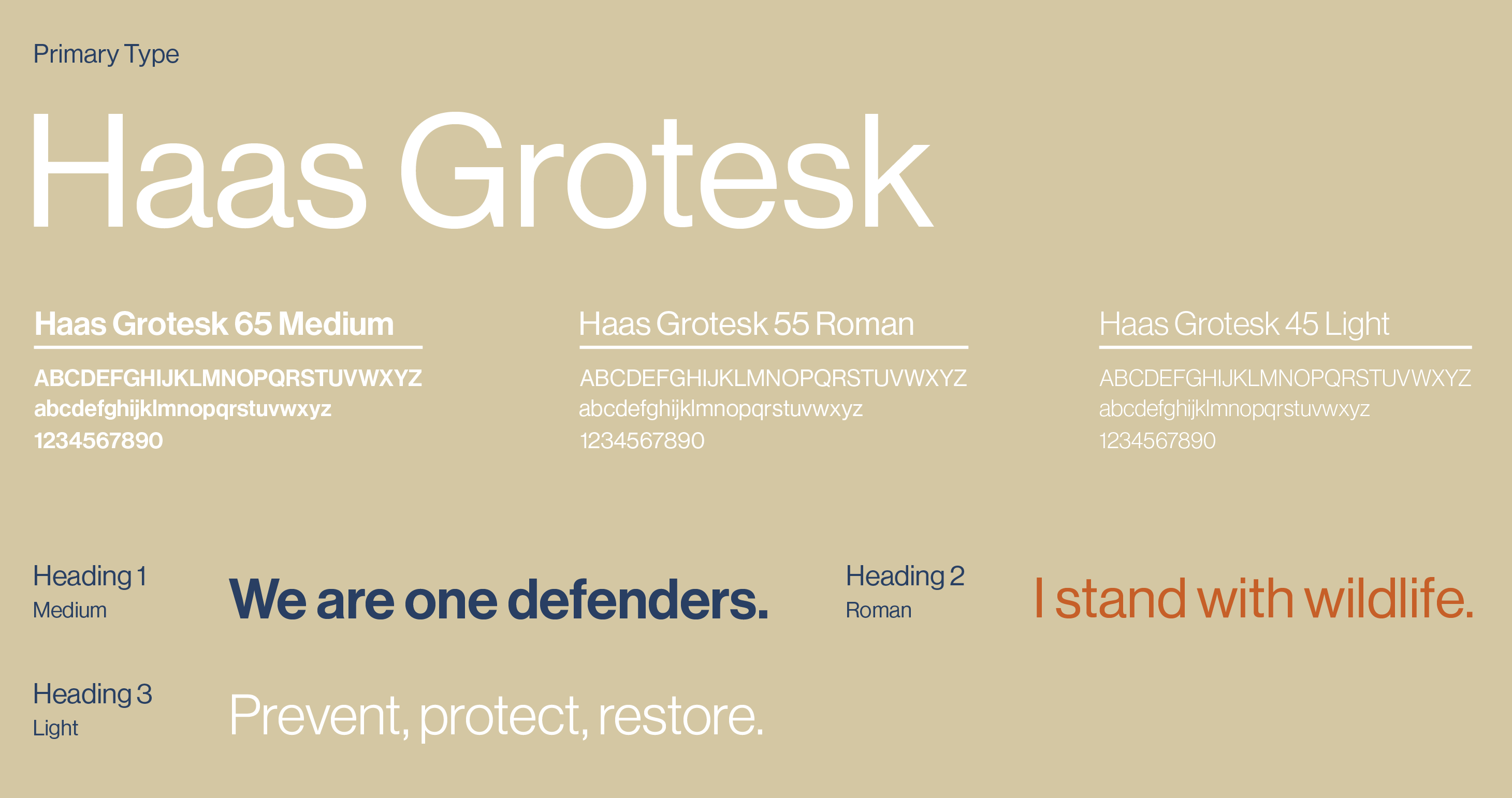
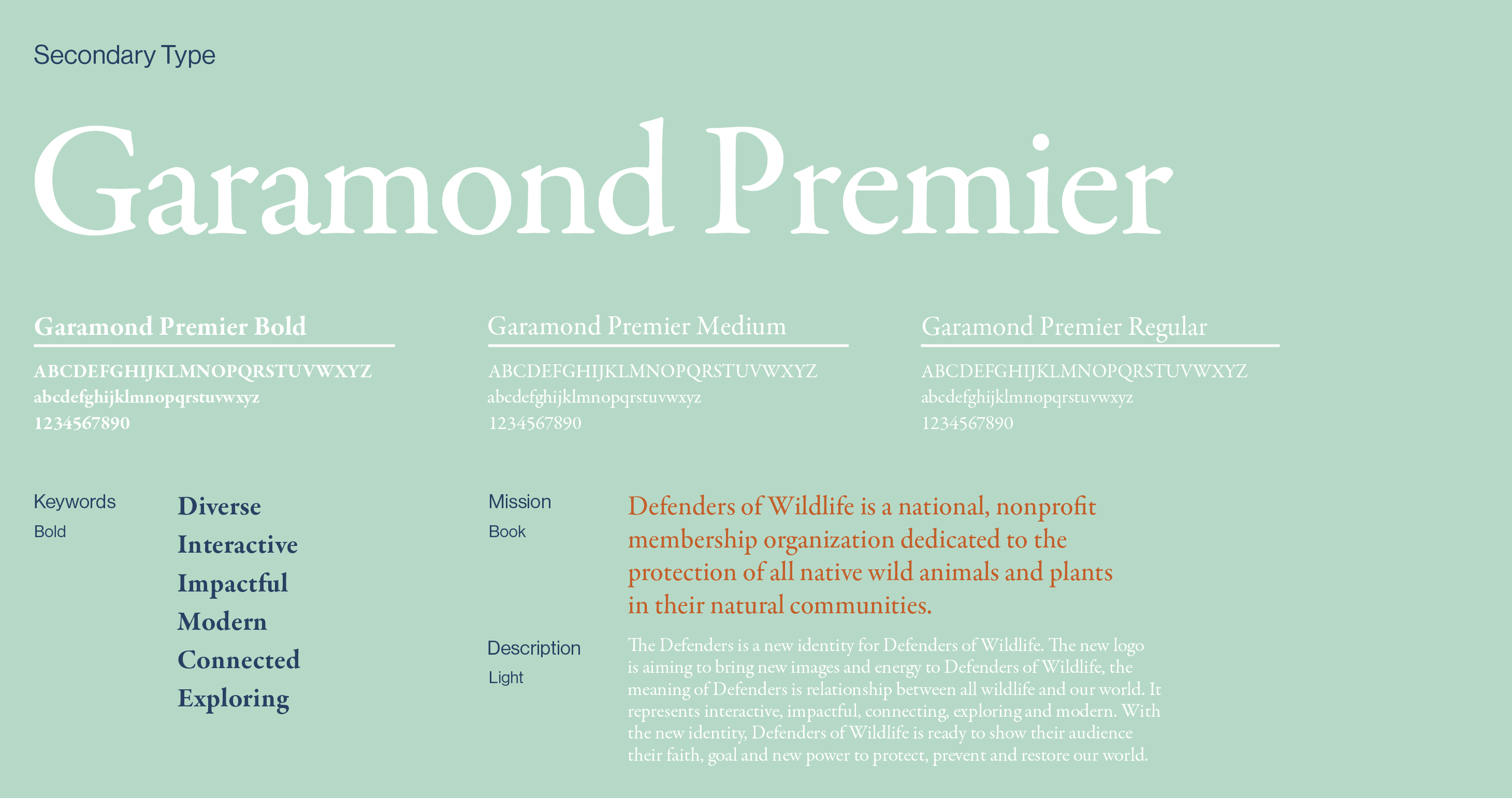
Typography
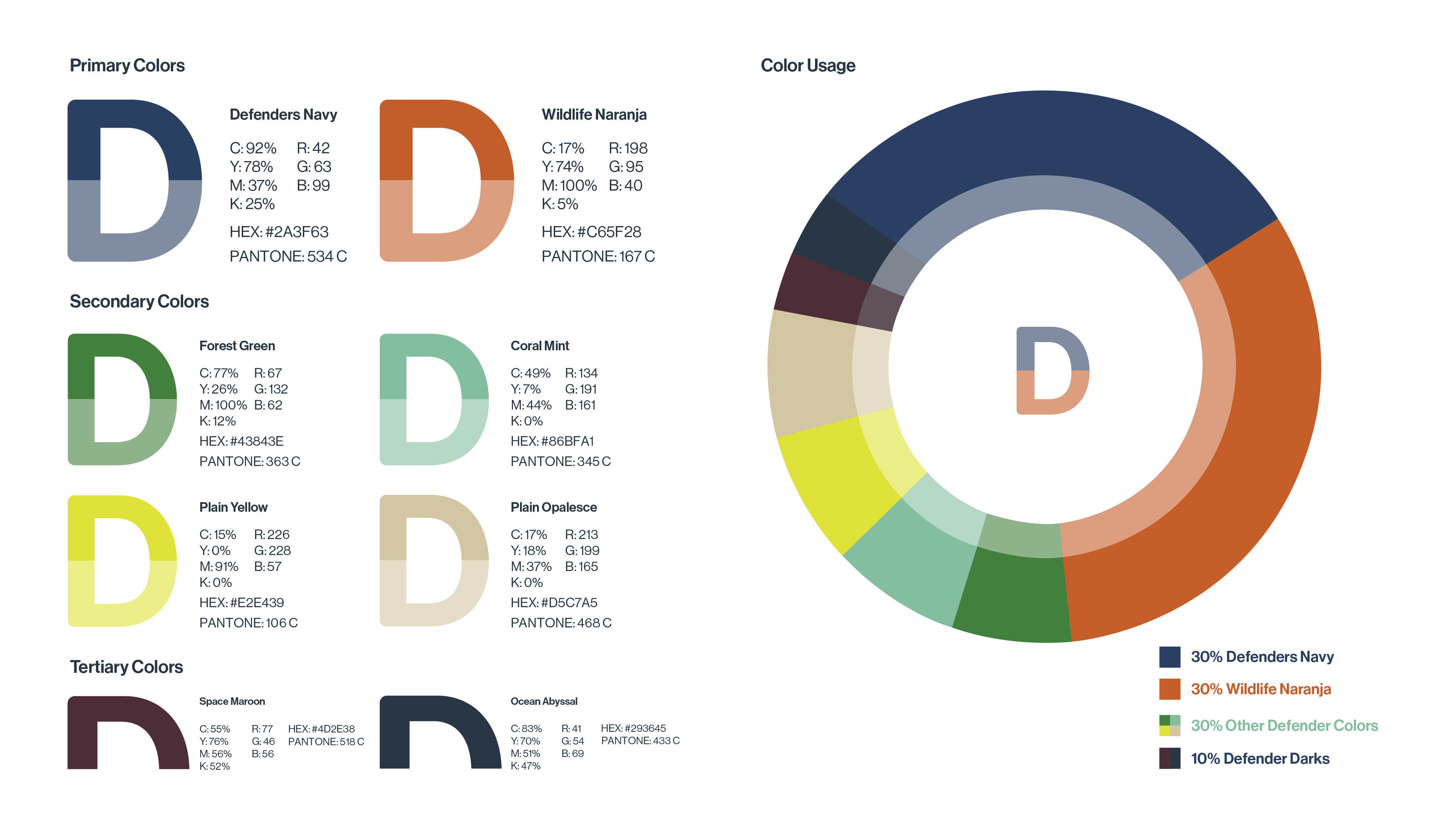
Colors
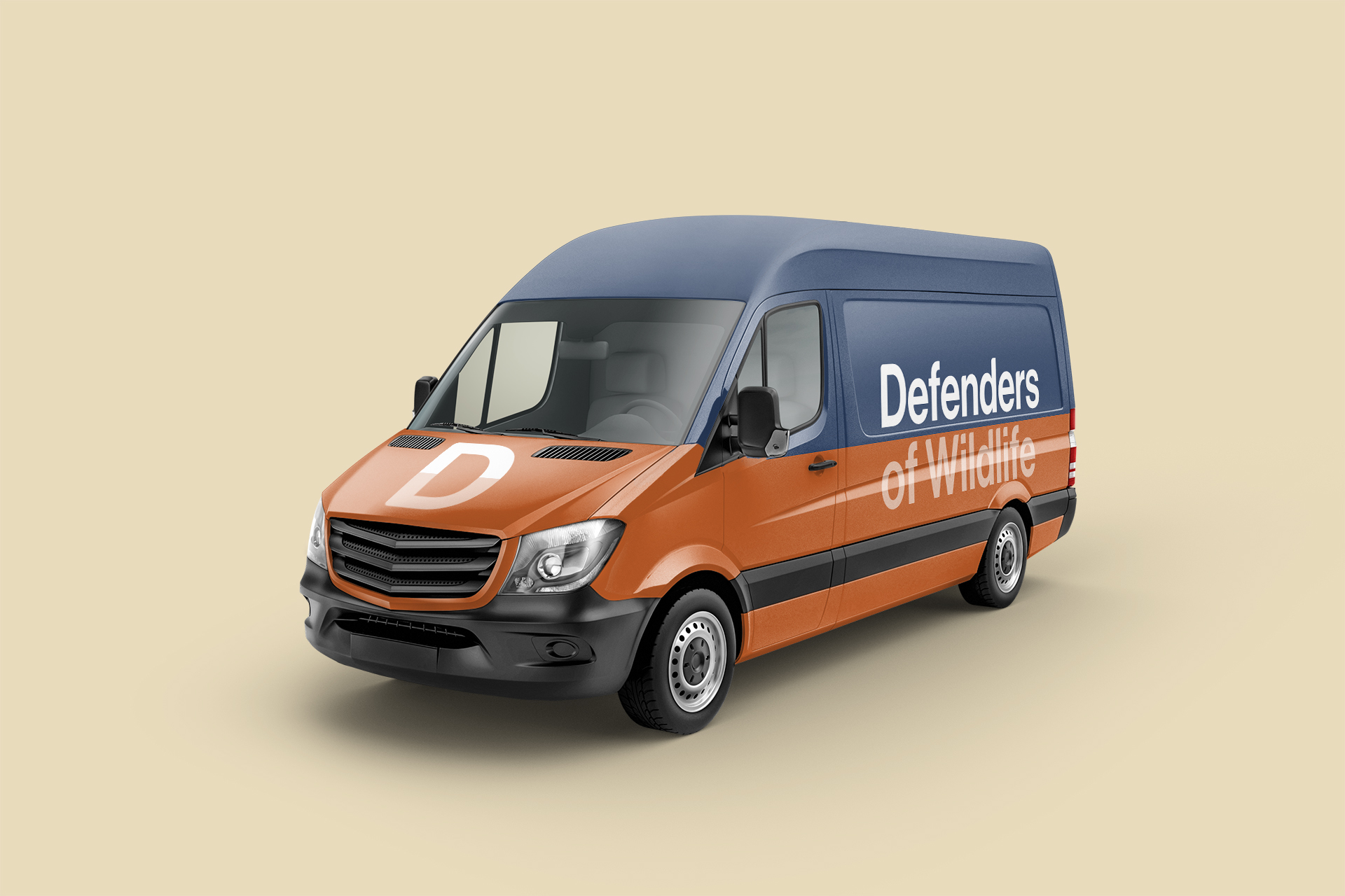
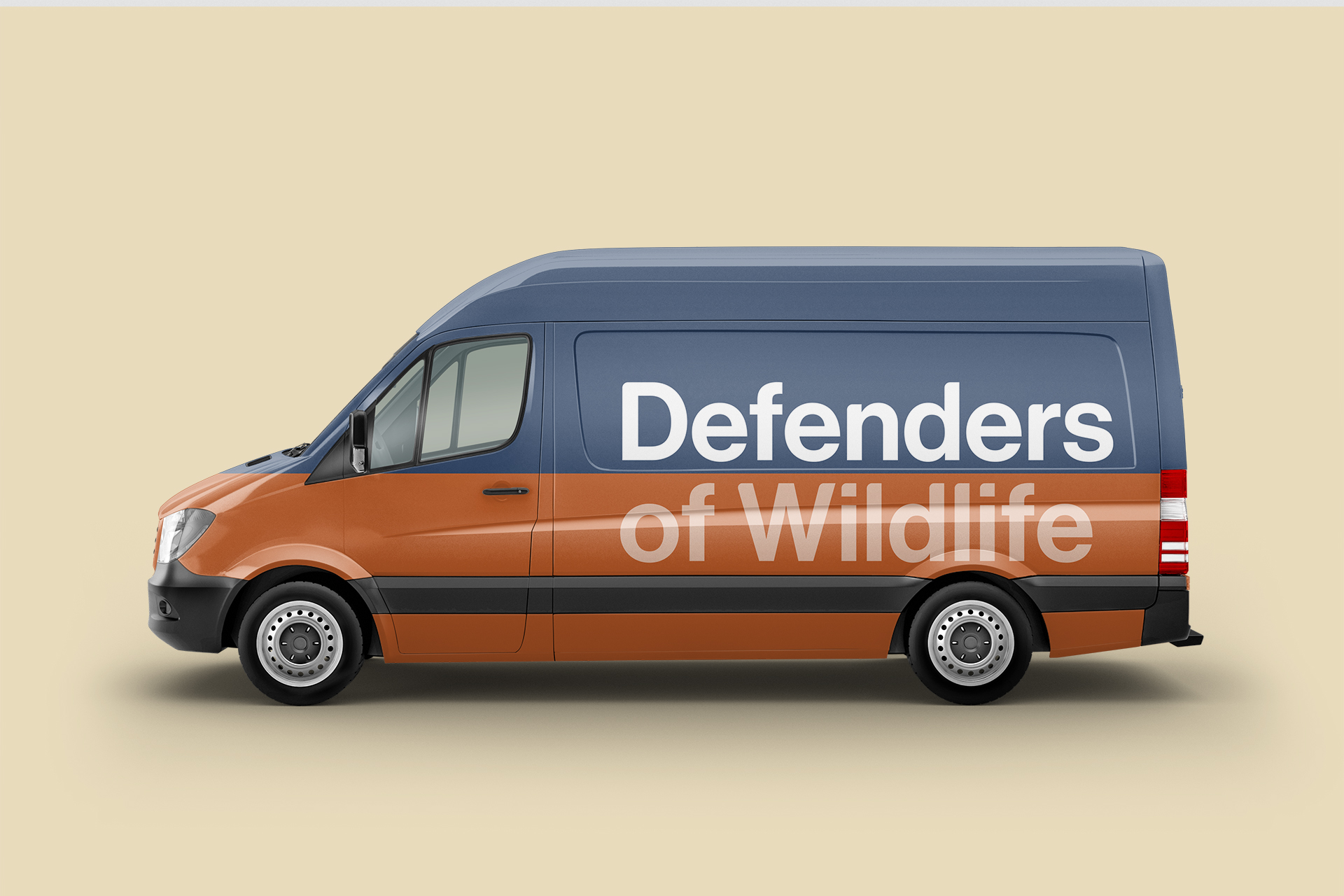
The color palette is called “Reflecting”. The chosen colors represent the relationship between humans, wildlife and the environment. The colors show the Defenders’ spirit and promote brand recognition when correctly. Defender Navy and Wildlife Naranja are the brand’s primary colors. In addition, secondary color palettes are also inspired by wildlife habitats in our eco-system. These colors introduce to branding related materials when necessary. The new colors are aiming to bring new energy and meanings to the public, and give the Defenders of Wildlife more younger, energetic and modern feelings.
The color palette is called “Reflecting”. The chosen colors represent the relationship between humans, wildlife and environment. The colors show Defenders’ spirit and promotes brand recognition when correctly. Defender Navy and Wildlife Naranja are the brand’s primary colors. In addition, secondary color palettes are also inspired by wildlife habitats in our eco-system. These colors introduce to branding related materials when necessary. The new colors are aiming to bring new energy and meanings to the public, and give the Defenders of Wildlife more younger, energetic and modern feelings.
The color palette is called “Reflecting”. The chosen colors represent the relationship between humans, wildlife and the environment. The colors show Defenders’ spirit and promote brand recognition when correctly. Defender Navy and Wildlife Naranja are the brand’s primary colors. In addition, secondary color palettes are also inspired by wildlife habitats in our eco-system. These colors introduce to branding related materials when necessary. The new colors are aiming to bring new energy and meanings to the public, and give the Defenders of Wildlife more younger, energetic and modern feelings.
Photographic Style
The wildlife photography shorted by famous photographers, and most photos are focused on showing how close wildlife with the human being, how they living with us and how their habitats are changing. Through the photographic style we deliver, Defenders of Wildlife is ready to show their new faith and image to the community and their audience.
The wildlife photography shorted by famous photographers, and most photos are focus on showing how close wildlife with human being, how they living with us and how their habitats are changing. Through the photographic style we deliver, Defenders of Wildlife is ready to show their new faith and image to the community and their audience.
The wildlife photography shorted by famous photographers, and most photos are focused on showing how close wildlife with the human being, how they living with us and how their habitats are changing. Through the photographic style we deliver, Defenders of Wildlife is ready to show their new faith and image to the community and their audience.
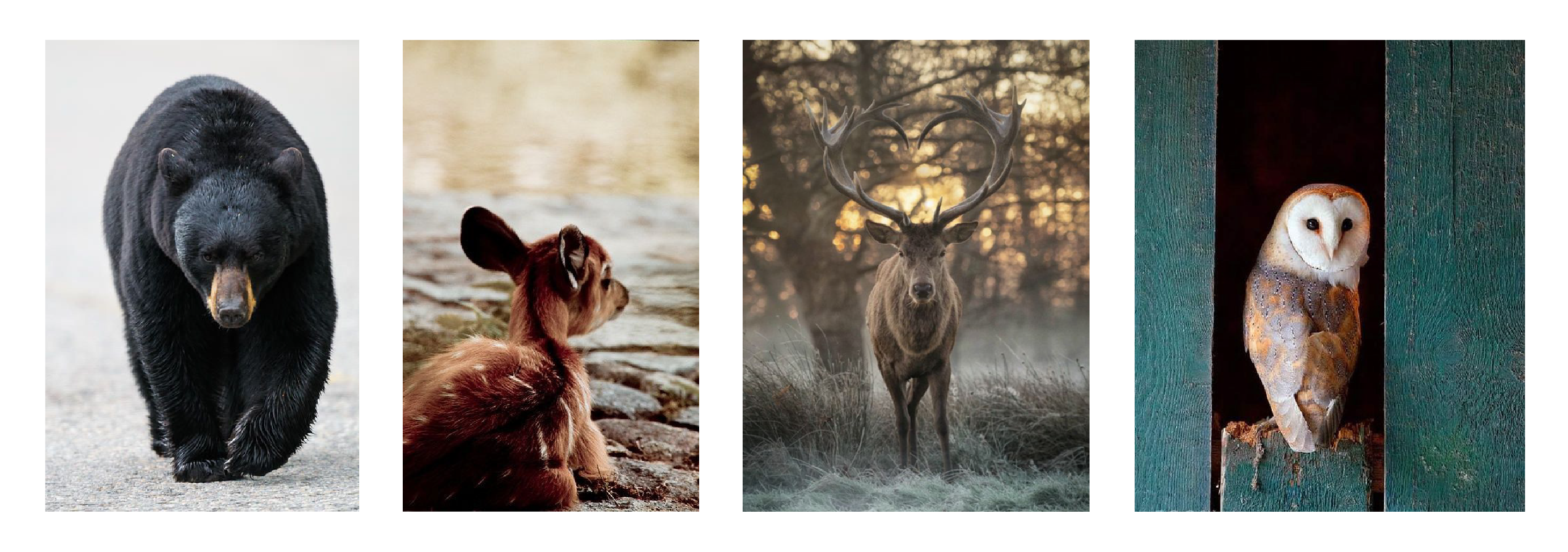
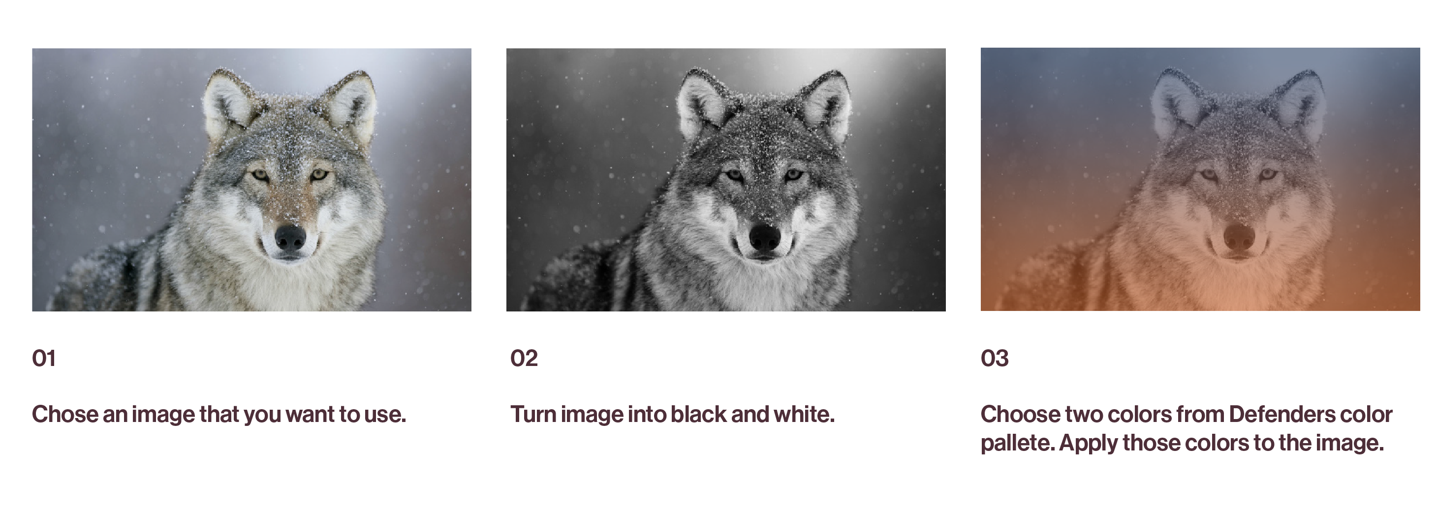
Image Treatment
Colors from the Defenders palettes can be used to build a unique mood. The monotone effect can be applied for branding mate-rials but descriptive photographs should remain in full color. In addition to the monotone effect, duotone effect, and overlay.
Colors from the Defenders palettes can be used to build a unique mood. The monotone effect can be applied for branding mate- rials but descriptive photographs should remain in full color. In addition to monotone effect, duotone effect, and overlay.
Colors from the Defenders palettes can be used to build a unique mood. The monotone effect can be applied to branding materials but descriptive photographs should remain in full color. In addition to the monotone effect, duotone effect, and overlay.
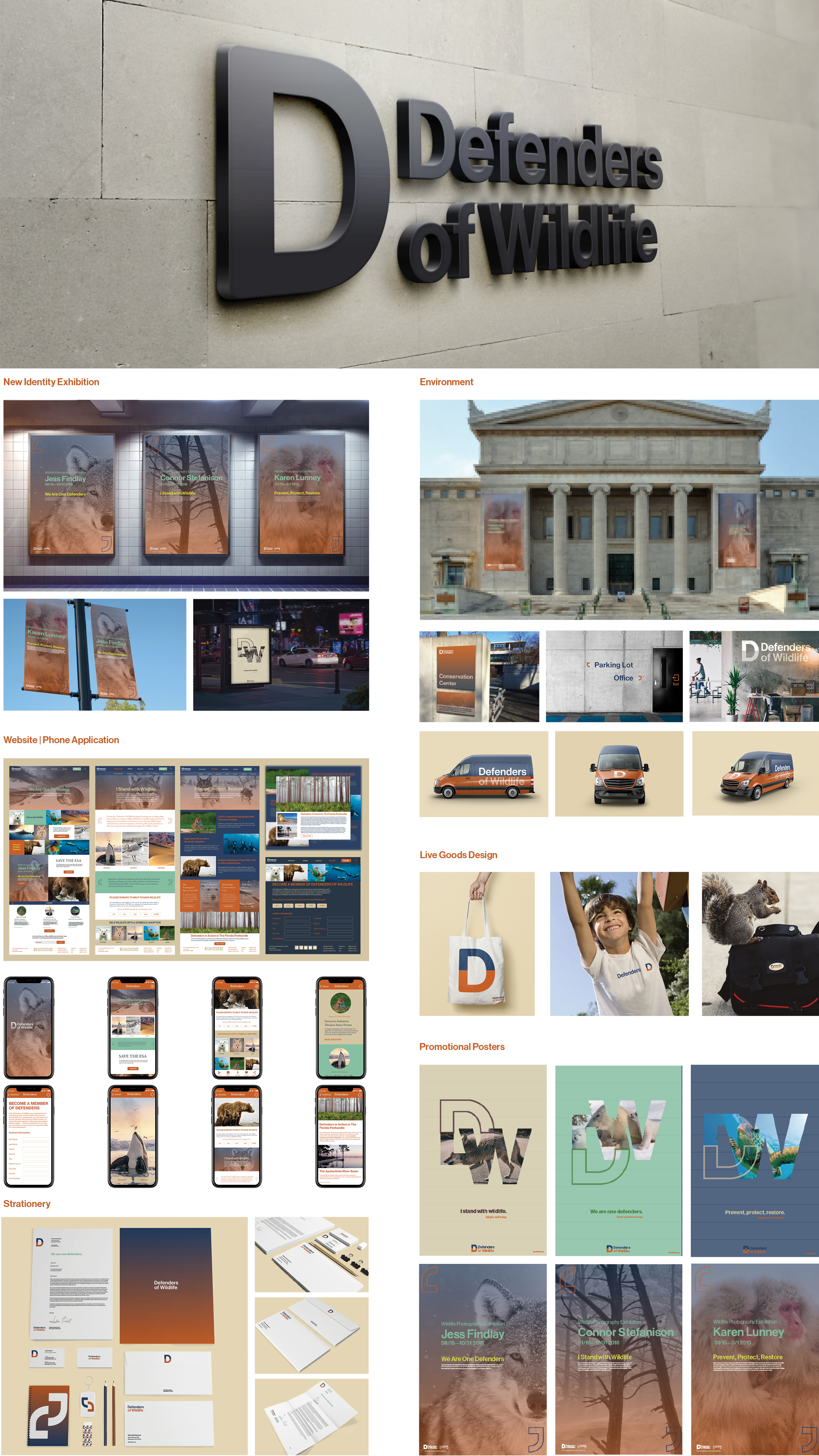
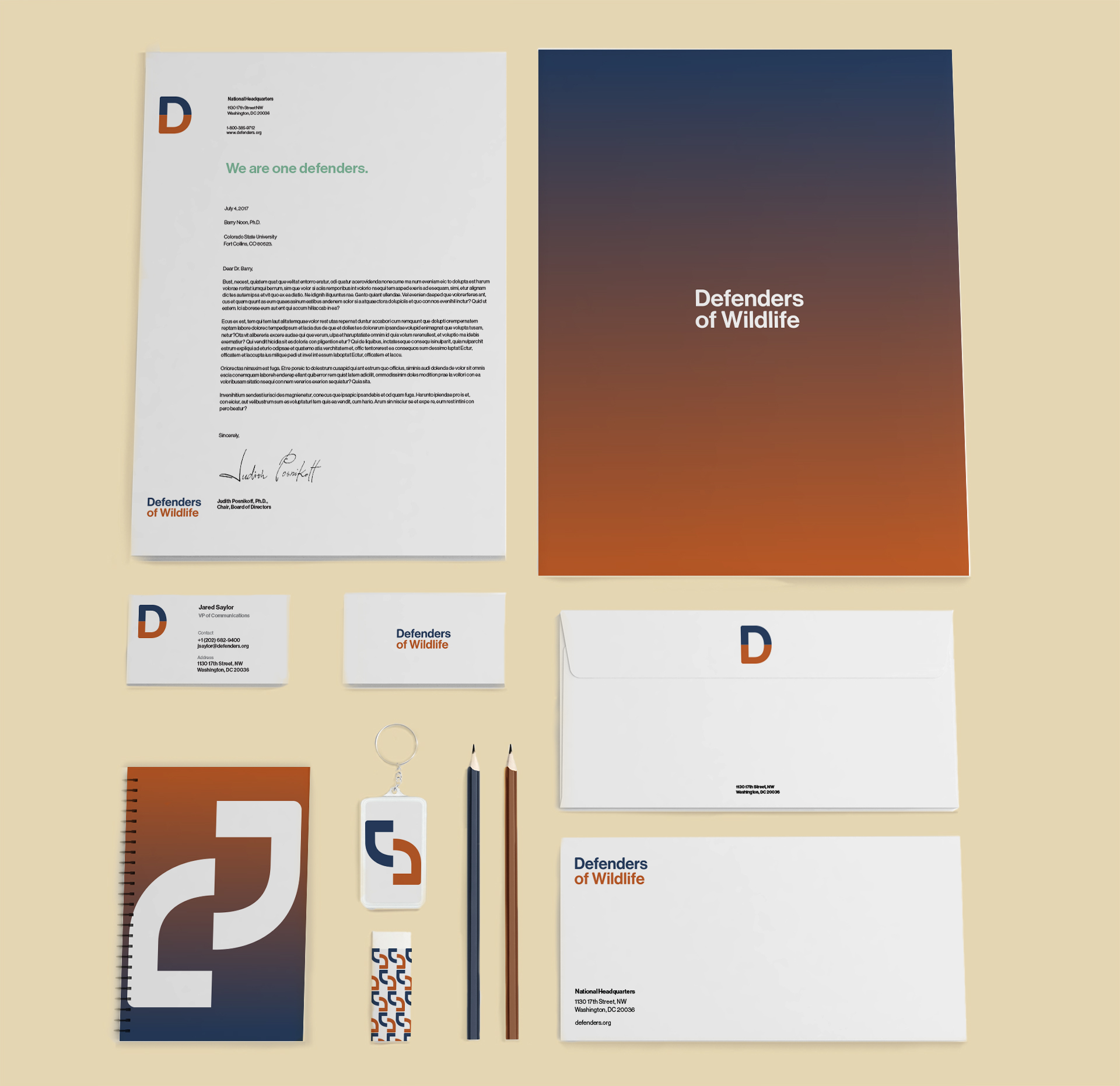
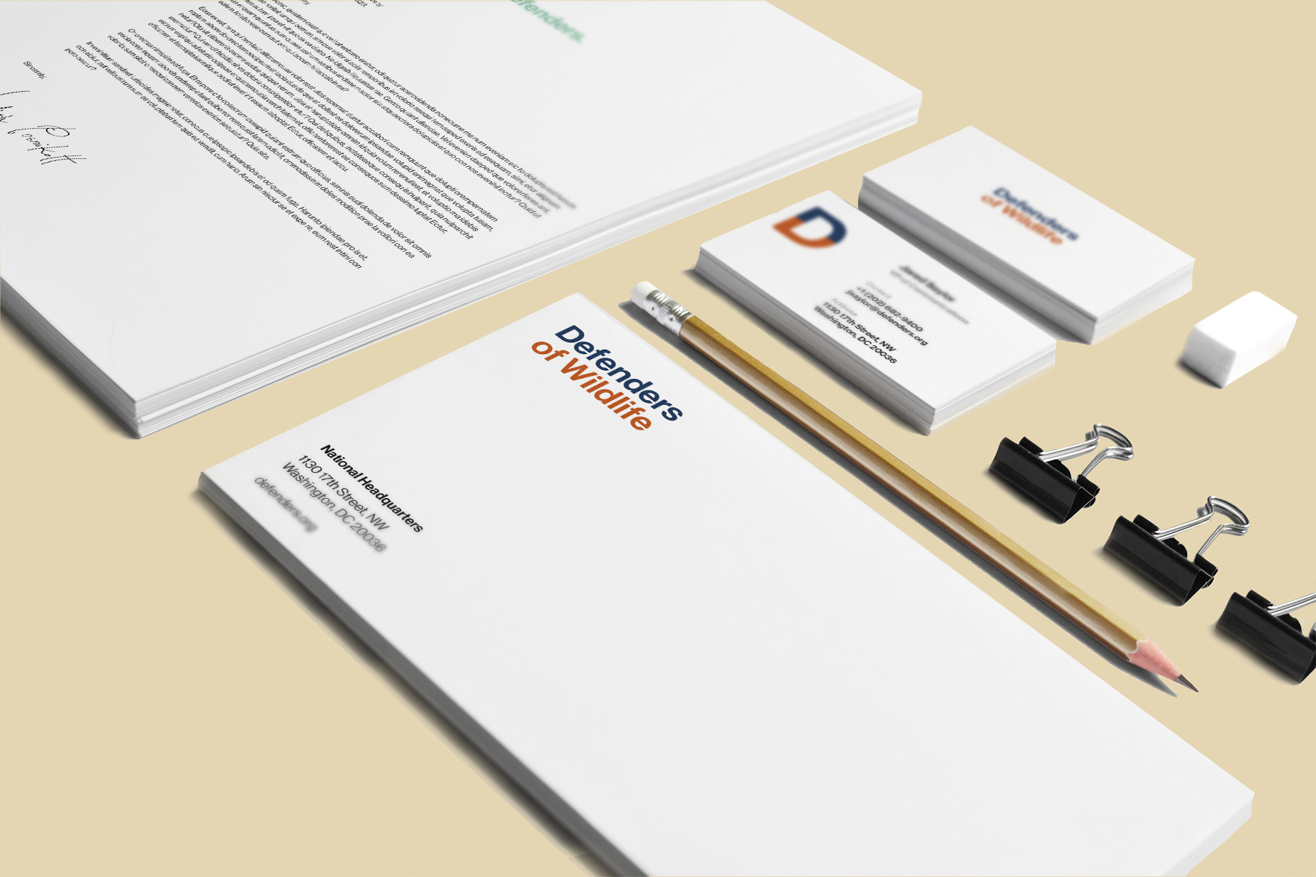
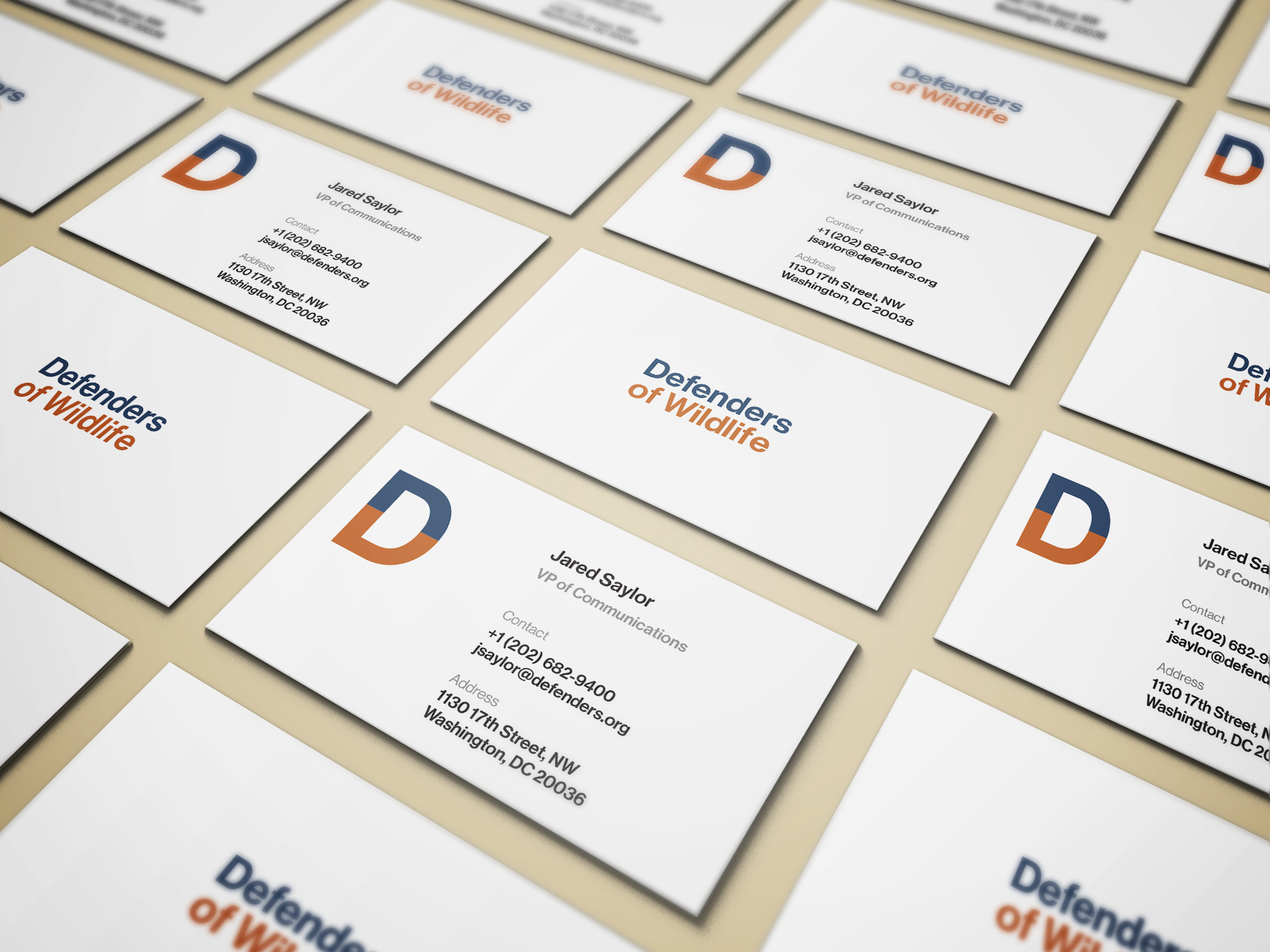
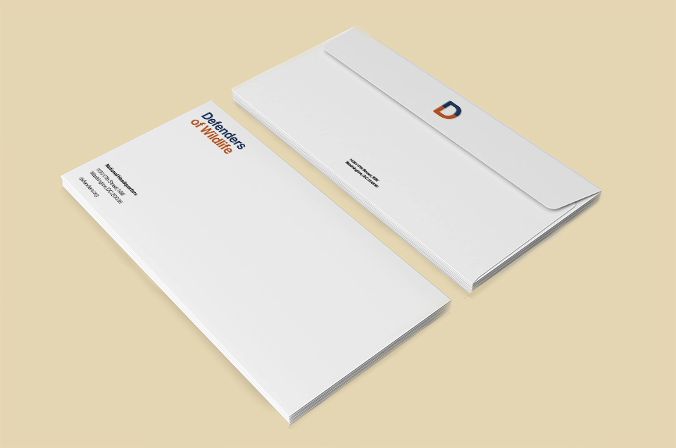
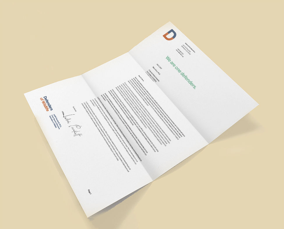
ID Collateral
New Identity made of simple geometry, the mark can project a wide range of expressions, from serious to lively, and has built-in flexibility that reflects the idea of diversity.
New Identity made of simple geometry, the mark can project a wide range of expressions, from serious to lively, and has a built-in flexibility that reflects the idea of diversity.
New Identity made of simple geometry, the mark can project a wide range of expressions, from serious to lively, and has built-in flexibility that reflects the idea of diversity.
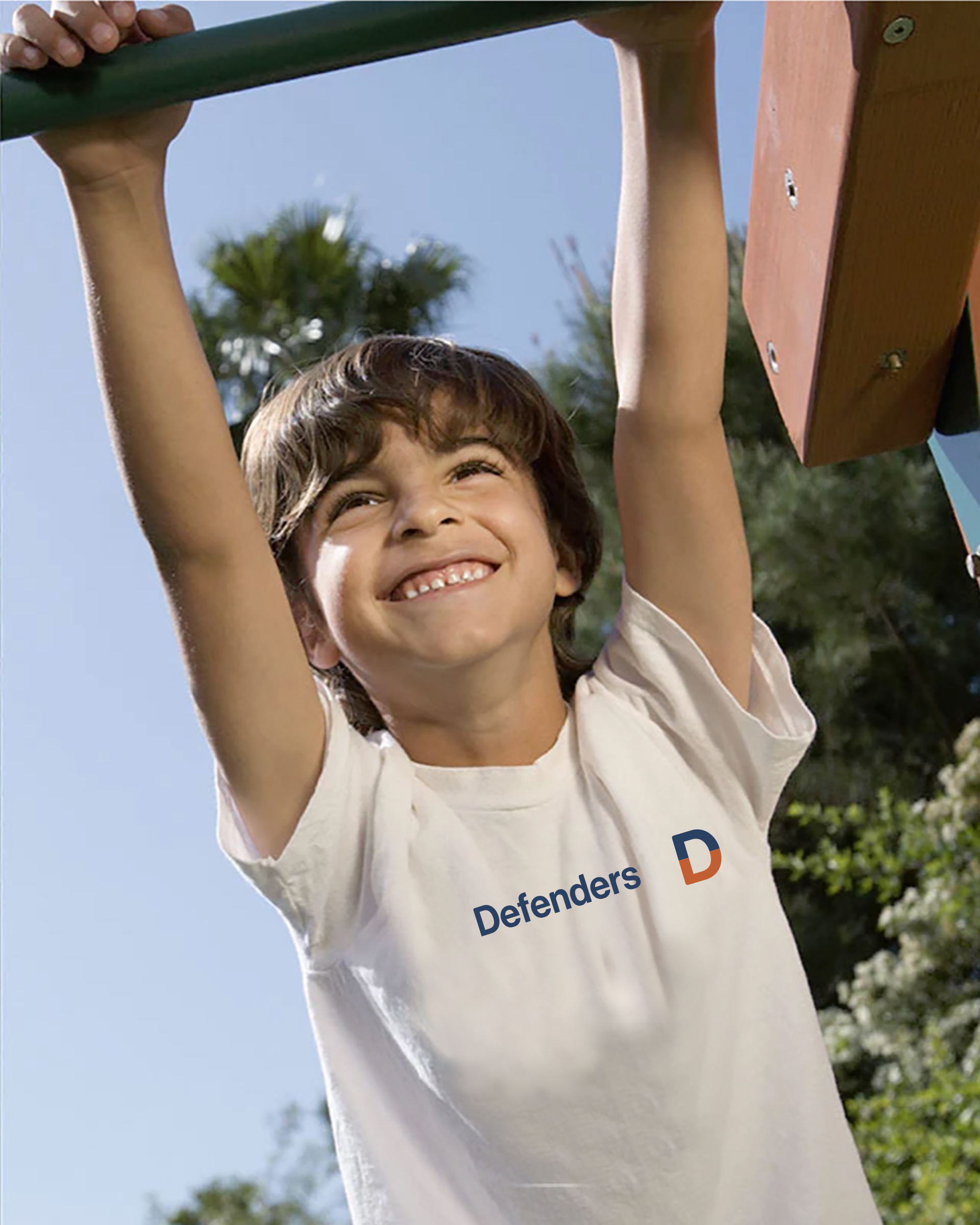
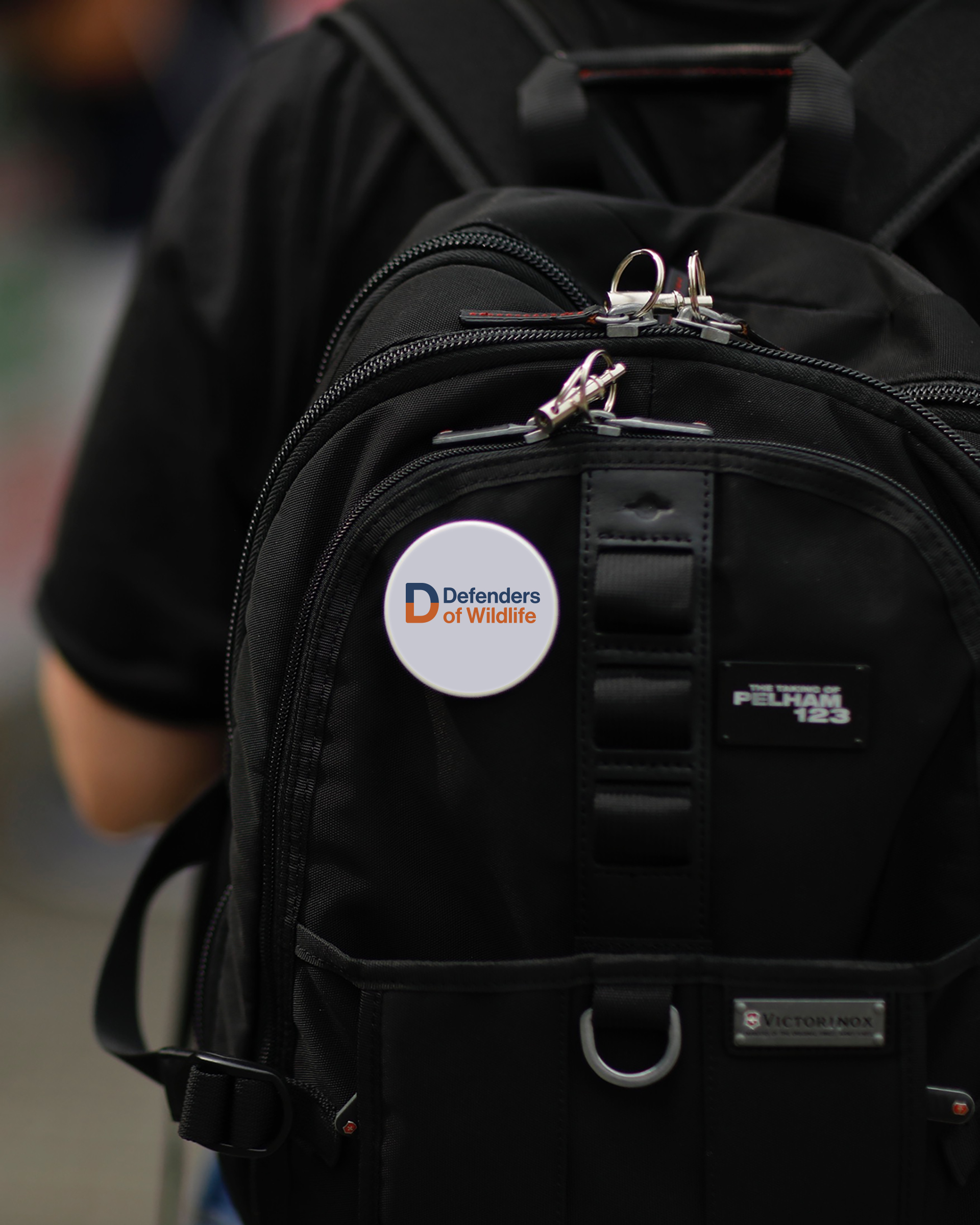
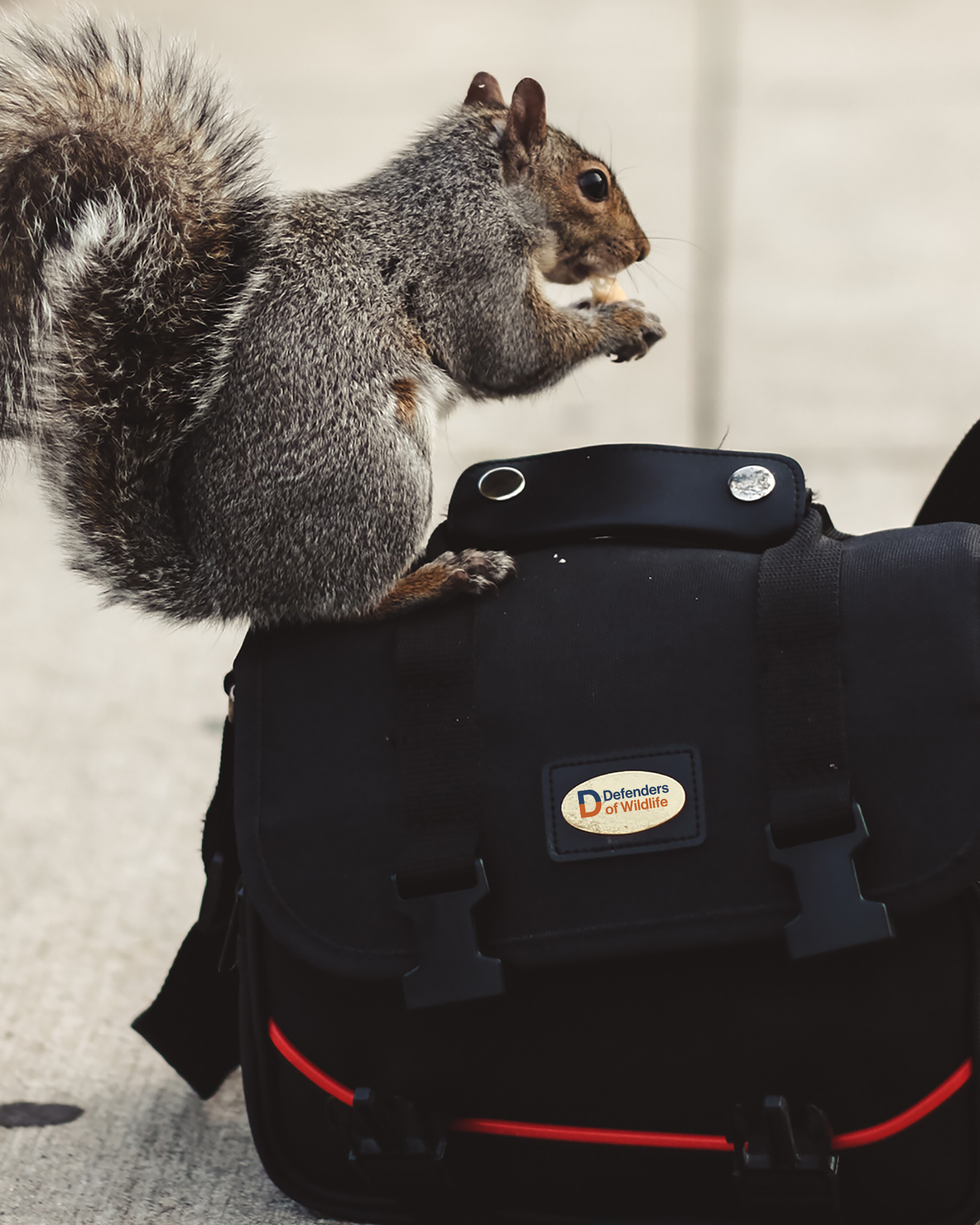
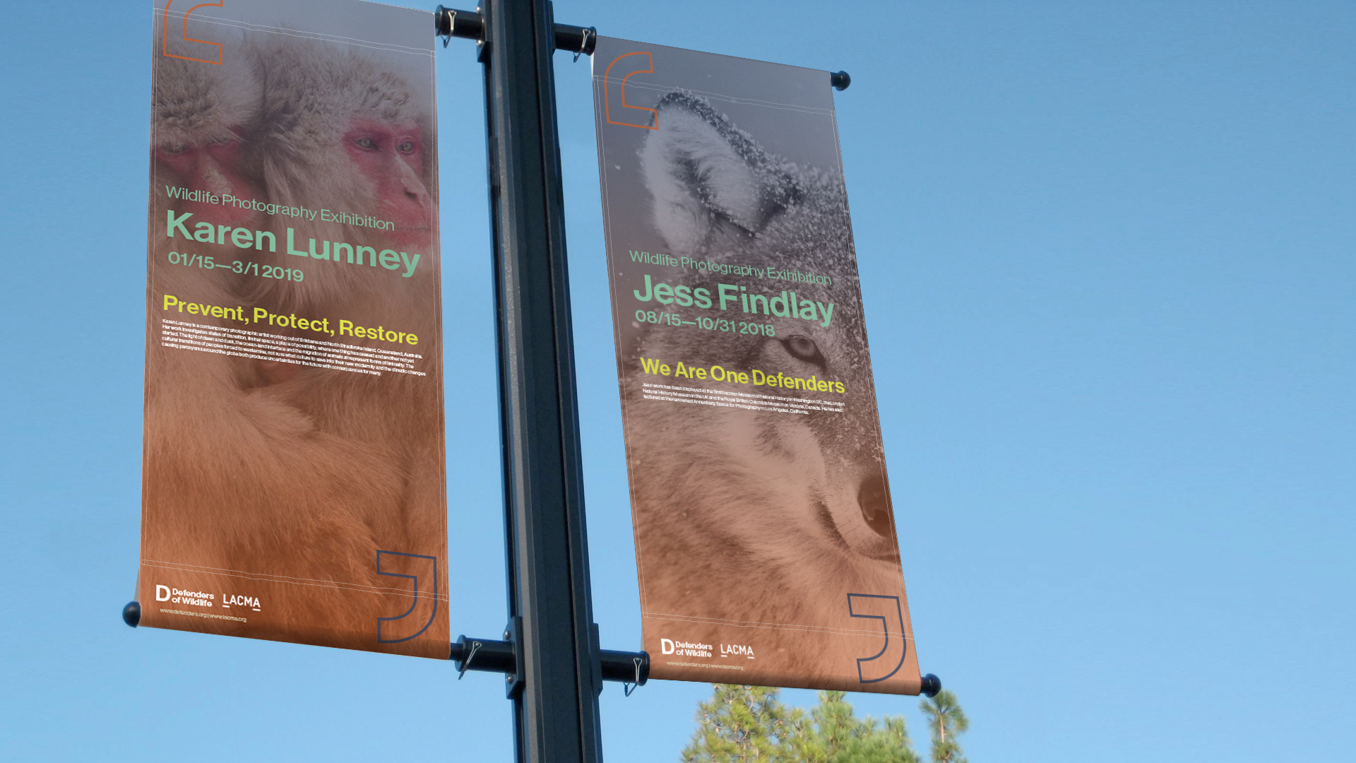
Swags
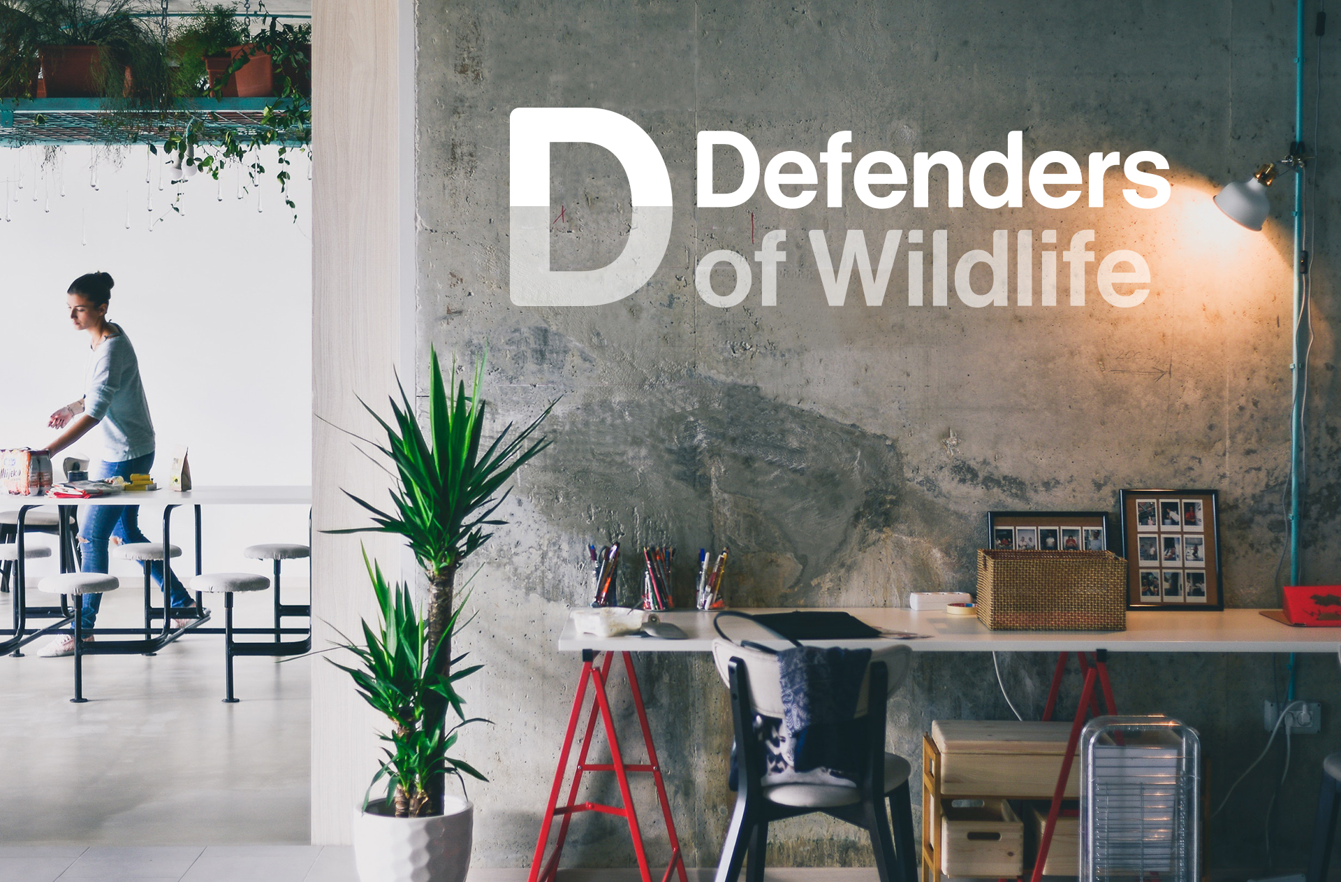
Environment

Vehicle

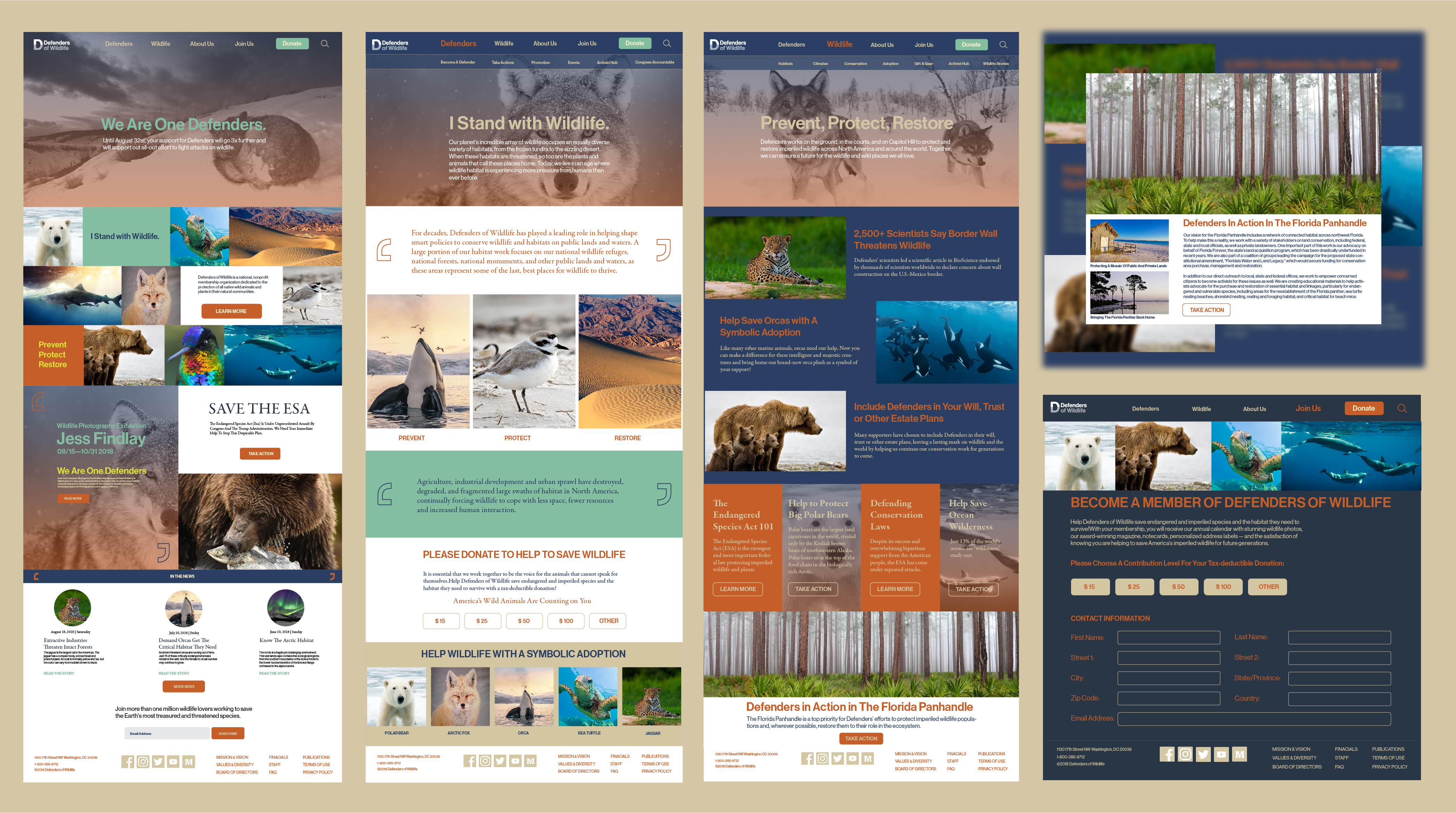
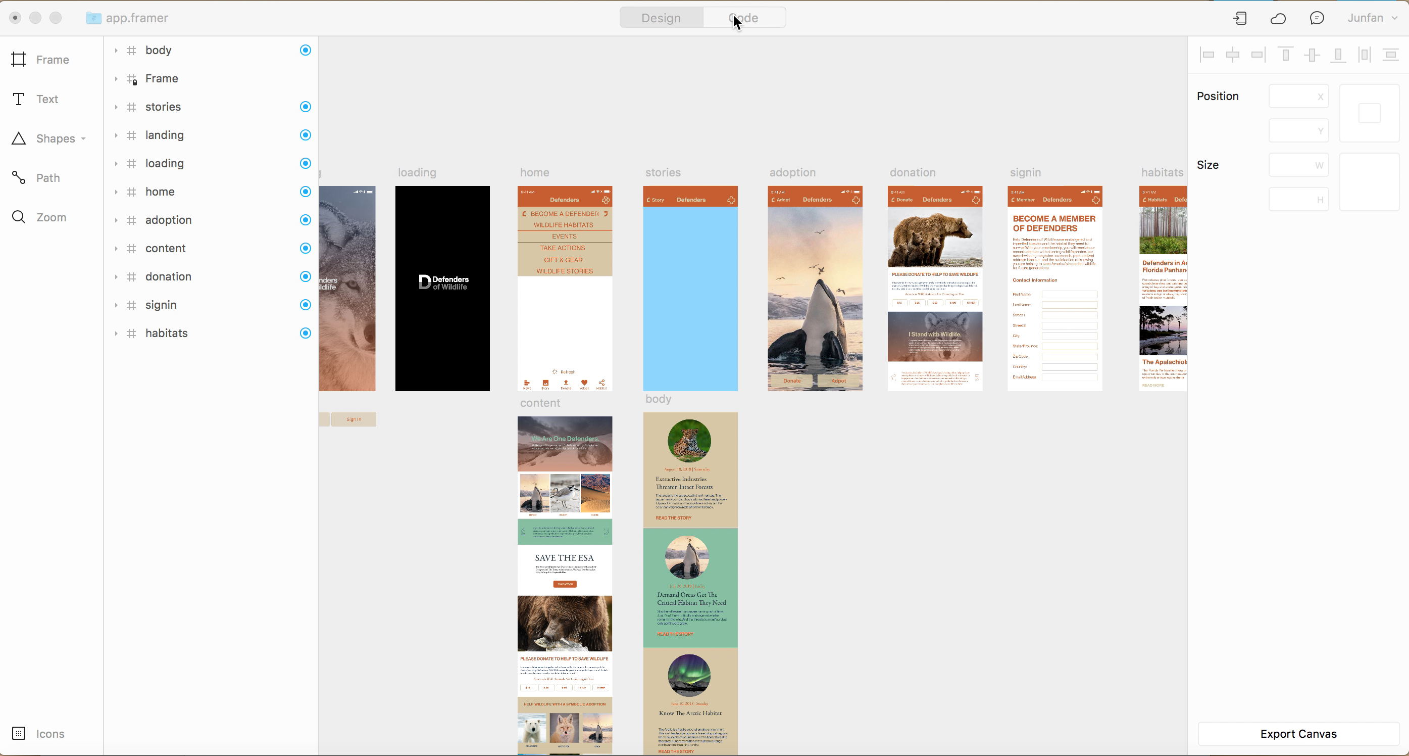
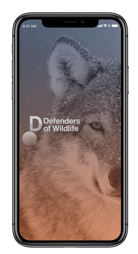
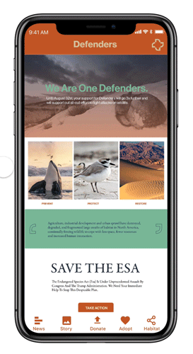
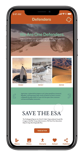
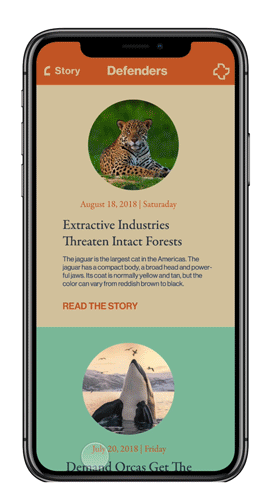
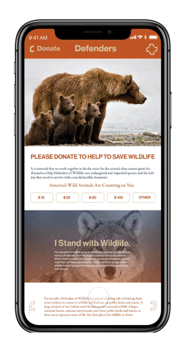
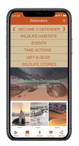
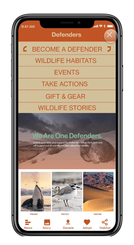
Website | Mobile App
The Defenders is having problems of changing of tastes, developing technology and attracting of wider audiences. Exploring opportunities of the website and other applications by using key brand elements and really consider user experiences are also really important in this project.
Defenders is having problems of changing of tastes, developing of technology and attracting of wilder audiences. Exploring opportunities of website and other applications by using key brand elements and really consider user experiences are also really important in this project.
Defenders are having problems of changing of tastes, developing technology and attracting of wider audiences. Exploring opportunities of the website and other applications by using key brand elements and really consider user experiences are also really important in this project.
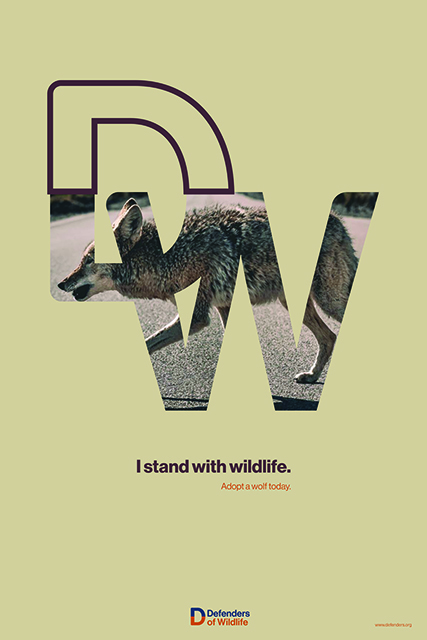
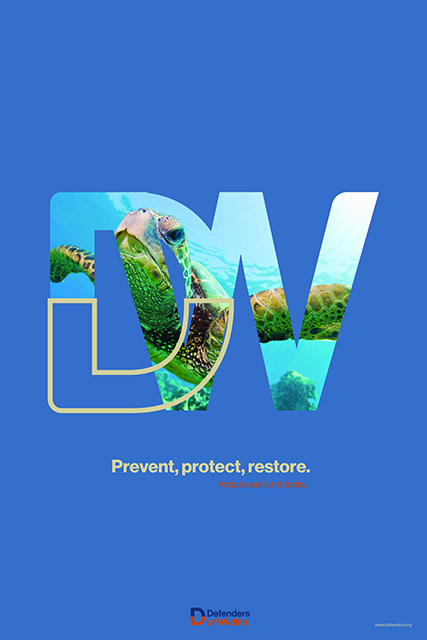
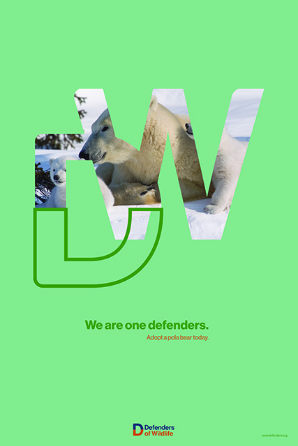
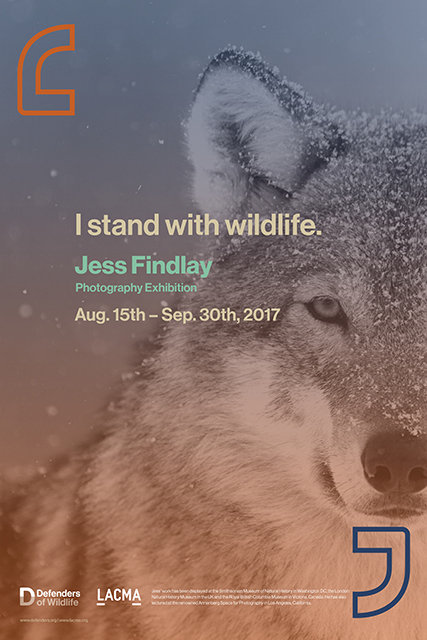
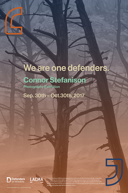
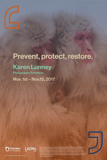
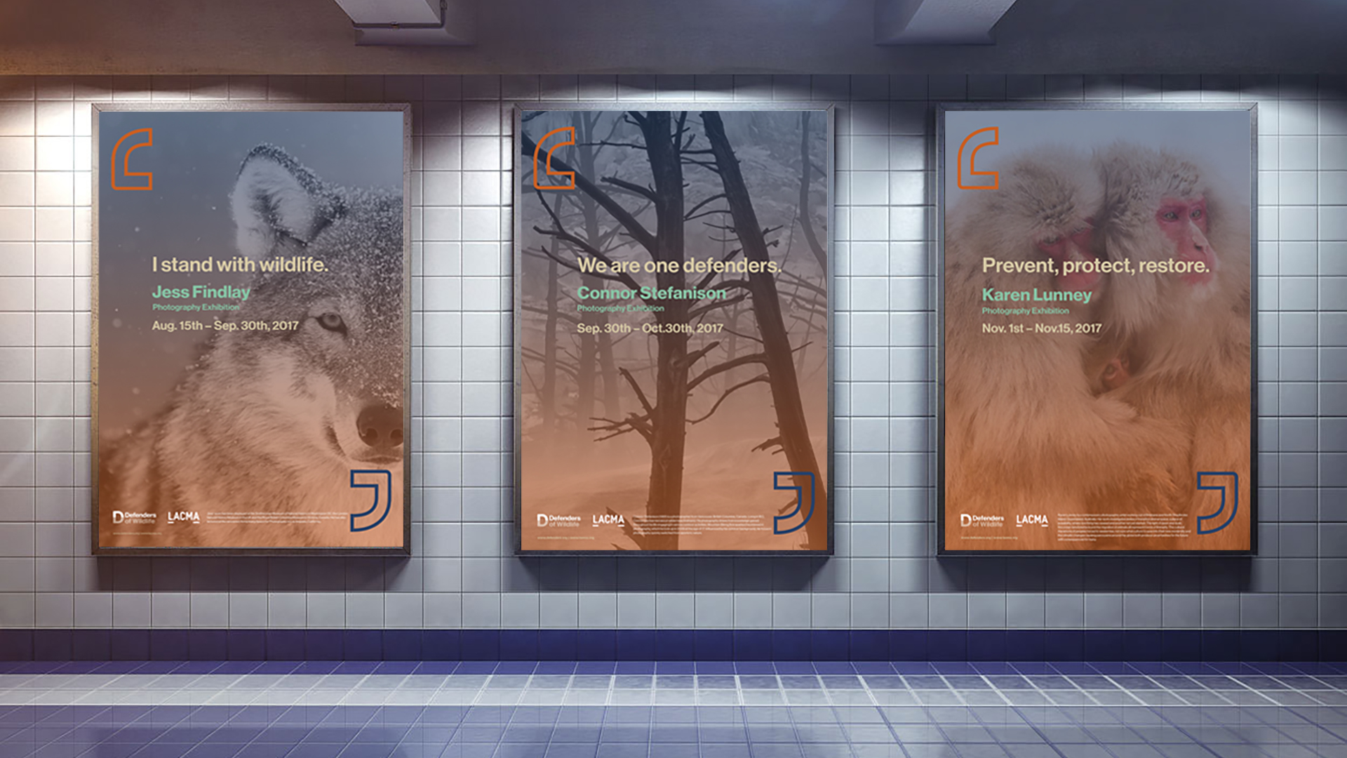
Brand Campaign
Brand Guideline
Brand Guideline